Introduction
In this article, we will go through the tutorial for the matplotlib heatmap tutorial for your machine learning and data science project. Matplotlib does not have a dedicated function for heatmap but we can build them using matplotlib’s imshow function. For better understanding, we will cover different types of examples of heatmap plot with matplotlib/
Importing Matplotlib Library
Before beginning with this matplotlib bar plot tutorial, we’ll need the Matplotlib Library.
import matplotlib.pyplot as plt
import numpy as np
Matplotlib Heatmap Tutorial
Heatmap is an interesting visualization that helps in knowing the data intensity. It conveys this information by using different colors and gradients. Heatmap is also used in finding the correlation between different sets of attributes.
NOTE – There isn’t any dedicated function in Matplotlib for building Heatmaps. This is why majorly imshow function is used.
Syntax of Imshow ( Matplotlib Function used for building Heatmap)
matplotlib.pyplot.imshow(X,cmap=None,norm=None,aspect=None, interpolation=None,alpha=None,vmin=None,vmax=None,origin=None,filternorm=1, filterrad=4.0,resample=None, url=None,data=None, **kwargs)
- X : Array-like or PIL Image – Here the input data is provided in the form of arrays or images.
- cmap : str or Colormap, default: ‘viridis’ – This parameter takes the colormap instance or registered colormap name.
- norm : Normalize, optional – This parameter helps in data normalization.
- aspect : {‘equal’, ‘auto’} or float, default: equal – This parameter determines the aspect ratio of the axes.
- interpolation : str, default: ‘antialiased’ – With the help of this parameter, we can perform different types of interpolation as per our requirement.
- alpha : float or array-like, optional – It increases or decreases the transparency of the plot.
- vmin, vmax : float, optional – These parameters are useful when we want to set the data range that a colormap will cover.
- origin : {‘upper’, ‘lower’}, default: upper – The originating coordinate is set using this parameter.
- filternorm : bool, default: True – This is acting as resize filter.
- filterrad : float > 0, default: 4.0 – This is the filter radius for filters.
- resample : bool, default: True – If passed True, a full resampling method is used. If mentioned false, only resample when the output image is larger than the input image.
- url : str, optional – Setting the url of axes image.
The result of this function is a histogram with desired features.
[adrotate banner=”3″]
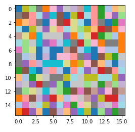
Example 1: Simple HeatMap using Matplotlib imshow function
As already mentioned heatmap in matplotlib can be build using imshow function. You can either use random data or a specific dataset. After this imshow function is called where we pass the data, colormap value and interpolation method (this method basically helps in improving the image quality if used).
data = np.random.random((16, 16))
plt.imshow(data, cmap='tab20_r', interpolation='nearest')
plt.show()
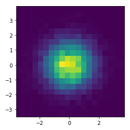
Example 2: Heatmap with 2D Histogram using imshow
For the 2nd example, we will be learning how to build 2-D histogram with the help of numpy and matplotlib’s imshow function. First, we’ll generate random data, then the data is passed to histogram2d function of numpy library. Lastly, imshow function is used for plotting the final heatmap visualization.
x = np.random.randn(10000)

y = np.random.randn(10000)


heatmap, xedges, yedges = np.histogram2d(x, y, bins=20)

extent = [xedges[0], xedges[-1], yedges[0], yedges[-1]]


plt.imshow(heatmap.T, extent=extent, origin='lower')
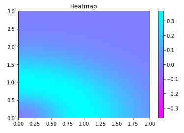
Example 3: Matplotlib Heatmap with Colorbar
The 3rd example of the heatmap tutorial will be based on the pcolormesh function. To build this type of heatmap, we need to call meshgrid and linspace functions of numpy. The next step is to perform some mathematical operatins for finding the minimum and maximum values for the plot.
We use the subplots function for plotting heatmap using pcolormesh function. The data for the three variables passed into the function of pcolormesh is generated using linspace function of numpy.
b, a = np.meshgrid(np.linspace(0, 3, 81), np.linspace(0,2, 81))

c = ( a ** 2 + b ** 2) * np.exp(-a ** 2 - b ** 2)
c = c[:-1, :-1]
l_a=a.min()
r_a=a.max()
l_b=b.min()
r_b=b.max()
l_c,r_c  = -np.abs(c).max(), np.abs(c).max()

figure, axes = plt.subplots()

c = axes.pcolormesh(a, b, c, cmap='cool_r', vmin=l_c, vmax=r_c)
axes.set_title('Heatmap')
axes.axis([l_a, r_a, l_b, r_b])
figure.colorbar(c)

plt.show()
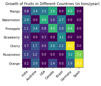
Example 4: Labeled Heatmap
The last example will tell us how labeled heatmaps can be made by using imshow function. The data for heatmap is passed as an array, with the help of subplots function and imshow function, we can plot labeled heatmap.
At last, we will labeling the x-axis and y-axis with the help of for loop.
fruits = ["Mango", "Watermelon", "Pineapple", "Strawberry",
              "Cherry", "Muskmelon", "Orange"]
Countries = ["India", "Australia", "USA",
           "Canada", "Brazil", "Germany", "Spain"]

harvest = np.array([[0.8, 2.4, 2.5, 3.9, 0.0, 4.0, 0.0],
                    [2.4, 0.0, 4.0, 1.0, 2.7, 0.0, 0.0],
                    [1.1, 2.4, 0.8, 4.3, 1.9, 4.4, 0.0],
                    [0.6, 0.0, 0.3, 0.0, 3.1, 0.0, 0.0],
                    [0.7, 1.7, 0.6, 2.6, 2.2, 6.2, 0.0],
                    [1.3, 1.2, 0.0, 0.0, 0.0, 3.2, 5.1],
                    [0.1, 2.0, 0.0, 1.4, 0.0, 1.9, 6.3]])


fig, ax = plt.subplots()
im = ax.imshow(harvest)

# Setting the labels
ax.set_xticks(np.arange(len(Countries)))
ax.set_yticks(np.arange(len(fruits)))
# labeling respective list entries
ax.set_xticklabels(Countries)
ax.set_yticklabels(fruits)

# Rotate the tick labels and set their alignment.
plt.setp(ax.get_xticklabels(), rotation=45, ha="right",
         rotation_mode="anchor")

# Creating text annotations by using for loop
for i in range(len(fruits)):
    for j in range(len(Countries)):
        text = ax.text(j, i, harvest[i, j],
                       ha="center", va="center", color="w")

ax.set_title("Growth of Fruits in Different Countries (in tons/year)")
fig.tight_layout()
plt.show()
- Also Read – Matplotlib Bar Plot – Complete Tutorial For Beginners
- Also Read – Matplotlib Scatter Plot – Complete Tutorial
- Also Read – Matplotlib Line Plot – Complete Tutorial for Beginners
- Also Read – Matplotlib Pie Chart – Complete Tutorial for Beginners
- Also Read – Matplotlib Animation – An Introduction for Beginners
- Also Read – 11 Python Data Visualization Libraries Data Scientists should know
Conclusion
We have reached the end of this article for matplotlib heatmap tutorial. Different functions are discussed that are helpful in building heatmap. Majorly we discuss imshow and pcolormesh functions. We also learn about the different functions that should be taken care while building heatmaps.
Reference – Matplotlib Documentation