Introduction
In this article, we will go through the tutorial for the matplotlib pie chart. Pie charts are one of the basic visualizations that is used very much in machine learning, data science projects. In the tutorial, we will learn how pie charts can be presented with different appearances with many useful examples
Importing Matplotlib Library
Before beginning with this matplotlib bar plot tutorial, we will have to import the required libraries for our examples.
import numpy as np
import matplotlib.pyplot as plt
Matplotlib Pie Chart Tutorial
Syntax
matplotlib.pyplot.pie(x, explode=None, labels=None, colors=None, autopct=None, pctdistance=0.6, shadow=False, labeldistance=1.1, startangle=None, radius=None, counterclock=True, wedgeprops=None, textprops=None, center=(0, 0), frame=False, rotatelabels=False, *, data=None)
- x : array-like – The wedge sizes is provided through this parameter.
- explode : array-like, Optional – This parameter is a len(x) array which specifies the fraction of the radius with which to offset each wedge.
- labels : List, optional – This is the sequence of strings used for labels
- colors : array-like, optional – For setting the color of pie chart.
- autopct : None, string, or function – This parameter is used for setting the labels inside wedges.
- shadow : bool, optional – We can set the shadow with this parameter.
- startangle : float – This specifies the starting angle.
- radius : float – This is the radius of pie chart.
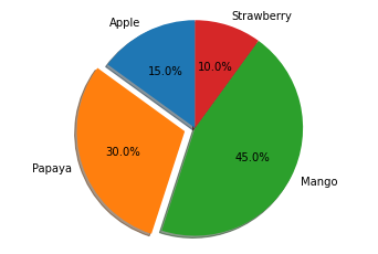
Example 1: Simple Matplotlib Pie Chart with Explosion
Here we will be building a simple pie chart with the help of matplotlib. After specifying the labels and sizes of the pie chart. The pie chart is plotted by using the pie function.
In the pie function, we use the explode parameter for expanding a wedge of pie chart. The autopct parameter helps in displaying the share of each wedge.
# Pie chart, where the slices will be ordered and plotted counter-clockwise:
labels = 'Apple', 'Papaya', 'Mango', 'Strawberry'
sizes = [15, 30, 45, 10]
explode = (0, 0.1, 0, 0)  # only "explode" the 2nd slice

fig1, ax1 = plt.subplots()
ax1.pie(sizes, explode=explode, labels=labels, autopct='%1.1f%%',
        shadow=True, startangle=90)
ax1.axis('equal')  # Equal aspect ratio ensures that pie is drawn as a circle.

plt.show()
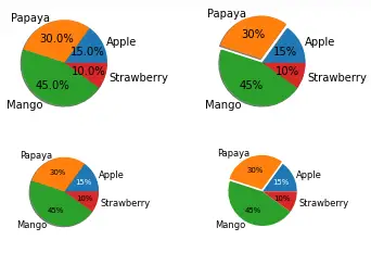
Example 2: Multiple Pie Charts with Matplotlib
The second example shows how multiple pie charts can be depicted using the same data. This example also tells us that we can use different datasets for building multiple pie charts for comparison studies.
With the help of the pie function only we are plotting the pie chart. To produce smaller pie charts, we use the reference of the bigger pie chart.
# Some data
labels = 'Apple', 'Papaya', 'Mango', 'Strawberry'
fracs = [15, 30, 45, 10]

# Make figure and axes
fig, axs = plt.subplots(2, 2)

# A standard pie plot
axs[0, 0].pie(fracs, labels=labels, autopct='%1.1f%%', shadow=True)

# Shift the second slice using explode
axs[0, 1].pie(fracs, labels=labels, autopct='%.0f%%', shadow=True,
              explode=(0, 0.1, 0, 0))

# Adapt radius and text size for a smaller pie
patches, texts, autotexts = axs[1, 0].pie(fracs, labels=labels,
                                          autopct='%.0f%%',
                                          textprops={'size': 'smaller'},
                                          shadow=True, radius=0.8)
# Make percent texts even smaller
plt.setp(autotexts, size='x-small')
autotexts[0].set_color('white')

# Use a smaller explode and turn of the shadow for better visibility
patches, texts, autotexts = axs[1, 1].pie(fracs, labels=labels,
                                          autopct='%.0f%%',
                                          textprops={'size': 'smaller'},
                                          shadow=False, radius=0.8,
                                          explode=(0, 0.05, 0, 0))
plt.setp(autotexts, size='x-small')
autotexts[0].set_color('white')

plt.show()
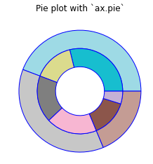
Example 3: Donut Chart
We have seen such kind of plot in our bar plot tutorial as well where we plotted a donut chart with the help of bar function.
Here we are plotting the donut chart with the help of pie function. For plotting this double-layered donut chart, we need to call the pie function twice.
The colors for both the inner and outer donut charts is set using color map function i.e. cmap.
fig, ax = plt.subplots()

size = 0.3
vals = np.array([[60., 32.], [37., 40.], [29., 10.]])

cmap = plt.get_cmap("tab20_r")
outer_colors = cmap(np.arange(3)*4)
inner_colors = cmap(np.array([1, 2, 5, 6, 9, 10]))

ax.pie(vals.sum(axis=1), radius=1, colors=outer_colors,
       wedgeprops=dict(width=size, edgecolor='b'))

ax.pie(vals.flatten(), radius=1-size, colors=inner_colors,
       wedgeprops=dict(width=size, edgecolor='b'))

ax.set(aspect="equal", title='Pie plot with `ax.pie`')
plt.show()
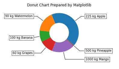
Example 4: Donut Chart with Labels
This last example of this pie chart tutorial shows how a donut chart is plotted along with extended labels for wedges. For plotting such a donut chart, we use wedges of the donut chart. Once we have decided the shape of the extended labels, enumerate function is used to loop over each wedge for placing the extended labels at an appropriate position.
This type of donut chart is helpful in extra information as these have labels that are easily visible to the viewers.
fig, ax = plt.subplots(figsize=(6, 3), subplot_kw=dict(aspect="equal"))

recipe = ["225 kg Apple",
          "90 kg Watermelon",
          "100 kg Banana",
          "60 kg Grapes",
          "1000 kg Mango",
          "500 kg Pineapple"]

data = [225, 90, 50, 60, 100, 5]

wedges, texts = ax.pie(data, wedgeprops=dict(width=0.5), startangle=-40)

bbox_props = dict(boxstyle="square,pad=0.3", fc="w", ec="k", lw=0.72)
kw = dict(arrowprops=dict(arrowstyle="-"),
          bbox=bbox_props, zorder=0, va="center")

for i, p in enumerate(wedges):
    ang = (p.theta2 - p.theta1)/2. + p.theta1
    y = np.sin(np.deg2rad(ang))
    x = np.cos(np.deg2rad(ang))
    horizontalalignment = {-1: "right", 1: "left"}[int(np.sign(x))]
    connectionstyle = "angle,angleA=0,angleB={}".format(ang)
    kw["arrowprops"].update({"connectionstyle": connectionstyle})
    ax.annotate(recipe[i], xy=(x, y), xytext=(1.35*np.sign(x), 1.4*y),
                horizontalalignment=horizontalalignment, **kw)

ax.set_title("Donut Chart Prepared by Matplotlib")

plt.show()
Conclusion
This matplotlib pie chart tutorial talked about how you can build a variety of line charts with the help of matplotlib. The plots covered talk about the intricate details that should be taken care of while building a variety of useful pie/donut charts. We also looked at how we can play around with the parameters for producing a combination of different surface plots.
Reference – Matplotlib Documentation