Introduction
In this tutorial, we will explain how to create Pie Chart in R with ggplot2 which is a highly popular and easy-to-use package to create stunning graphs and visualizations in R. We shall first understand the syntax of creating pie chart in ggplot2 and then cover multiple examples of it for better understanding of the beginners.
Syntax of Pie Chart in ggplot2
The minimal syntax for creating the Pie chart in ggplot2 is as follows –
ggplot(<data>, mapping = aes(<mapping>)) + geom_bar(stat=”identity”) +
coord_polar(theta = <“x” or “y”>)
The idea is first bar plot is created using geom_bar() and then it is converted to a pie chart using coord_polar() where theta signifies whether the angle of pie should map to x coordinate or y coordinate.
More details on coord_polar() can be found here.
ggplot2 lets you add more layers to the plot such as theme, labs, etc. to create more advanced Pie charts
Examples of Pie Chart in R using ggplot2
Loading ggplot2
library(ggplot2)
Dataset
We are going to create our own toy sample dataset of mobile phone companies and their market share. This is loaded into a data frame ‘data’ that will be used throughout the ggplot2 pie chart examples.
#create data frame
data <- data.frame(brand = c('Xiaomi','Samsung','Vivo','Realme','Oppo','Others'),
                   percent= c(27,18,21,8,12,14))
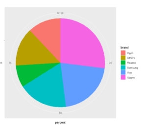
Example 1: Basic Pie Chart in ggplot2
We are going to load our data frame which consists of mobile phone companies and their respective market shares (in percentages) during a given quarter.
#create pie chart
ggplot(data, aes(x="", y=percent, fill=brand)) +
  geom_bar(stat="identity", width=1) +
  coord_polar("y", start=0)
Out[1]:
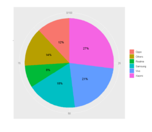
Example 2: Adding Labels to Pie Chart in ggplot2 with geom_text()
To get some perspective while visualizing we shall put labels on our pie chart denoting the value and also append the percentage sign to it. For this purpose, we shall use the geom_text() layer and pass in the required label.
ggplot(data, aes(x="", y=percent, fill=brand)) +
geom_bar(stat="identity", width=1) +
coord_polar("y", start=0) +
geom_text(aes(label = paste0(percent, "%")), position = position_stack(vjust=0.5)) +
labs(x =NULL, y = NULL, fill = NULL)
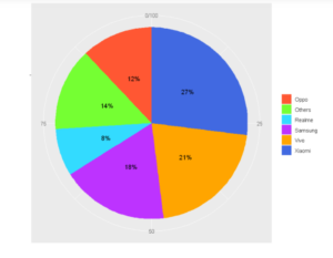
Example 3: Coloring Pie Chart Using scale_fill_manual()
In this example, we will explicitly pass the color of each pie as a parameter to the scale_fill_manual(), and the same is rendered in the final Pie chart
ggplot(data, aes(x="", y=percent, fill=brand)) +
geom_bar(stat="identity", width=1) +
coord_polar("y", start=0) +
geom_text(aes(label = paste0(percent, "%")), position = position_stack(vjust=0.5)) +
labs(x =NULL, y = NULL, fill = NULL) +
scale_fill_manual(values=c("#FF5733", "#75FF33", "#33DBFF", "#BD33FF",'orange','royalblue'))
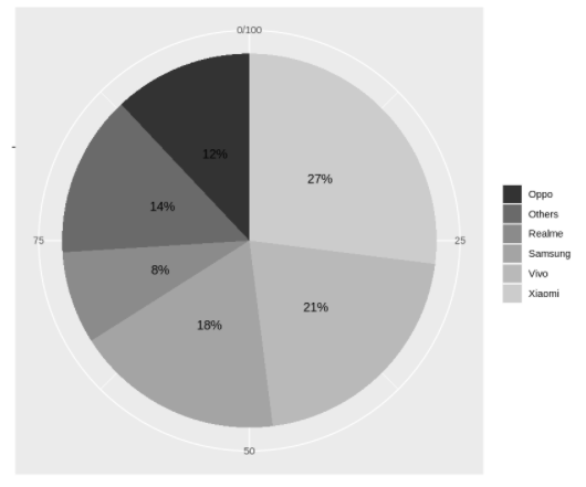
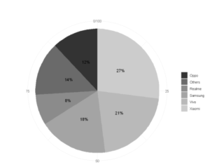
Example 4: Applying Gray Scale to Pie Chart using scale_fill_grey()
If we want to opt for a grey color palette for coloring pies of the pie chart in ggplot2, then we can use scale_fill_grey() as shown in the below example.
In [4]:
ggplot(data, aes(x="", y=percent, fill=brand)) +
geom_bar(stat="identity", width=1) +
coord_polar("y", start=0) +
geom_text(aes(label = paste0(percent, "%")), position = position_stack(vjust=0.5)) +
labs(x =NULL, y = NULL, fill = NULL) +
scale_fill_grey()
Out[4]:
Example 5: Using Minimal Theme with theme_minimal()
By default, the pie chart created with ggplot2 has a background grid, that may not be required by everyone. In this case, theme_minimal() can be used as shown in the below example –
ggplot(data, aes(x="", y=percent, fill=brand)) +
geom_bar(stat="identity", width=1) +
coord_polar("y", start=0) +
geom_text(aes(label = paste0(percent, "%")), position = position_stack(vjust=0.5)) +
labs(x =NULL, y = NULL, fill = NULL) +
scale_fill_grey() +
theme_minimal()
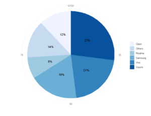
Example 6: Using RColorBrewer Color Pallete with scale_fill_brewer()
To use colors from the RColorBrewer package we shall add a layer scale_fill_brewer()
ggplot(data, aes(x="", y=percent, fill=brand)) +
geom_bar(stat="identity", width=1) +
coord_polar("y", start=0) +
geom_text(aes(label = paste0(percent, "%")), position = position_stack(vjust=0.5)) +
labs(x =NULL, y = NULL, fill = NULL) +
scale_fill_brewer(palette="Blues")+
theme_minimal()
Example 7: Adding Labels to Pie Chart using geom_label()
Instead of using geom_text, we can use geom_label, which also adds a border around the values.
ggplot(data, aes(x = "",y=percent, fill=brand)) +
geom_col(color = "black") +
geom_label(aes(label = paste0(percent, "%")), position = position_stack(vjust = 0.5), size=8, show.legend = FALSE) +
coord_polar(theta = "y")
Example 8: Apply Color to Labels
To apply the desired label color we shall use the color parameter inside the geom_label layer. In the below example, we pass the color as white.
ggplot(data, aes(x = "",y=percent, fill=brand)) +
geom_col(color = "black") +
geom_label(aes(label = paste0(percent, "%")), color = "white", position = position_stack(vjust = 0.5), size=8, show.legend = FALSE) +
coord_polar(theta = "y")
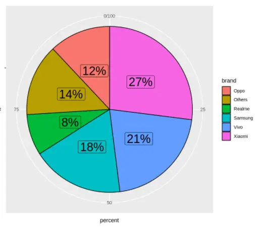
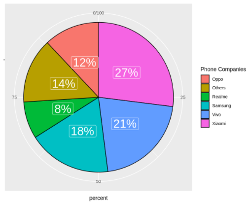
Example 9: Adding Custom Legend Title
The legend title can be customized with guides() layer as shown in the below example where the title has been changed to “Phone Companies”
In [9]:
ggplot(data, aes(x = "",y=percent, fill=brand)) +
geom_col(color = "black") +
geom_label(aes(label = paste0(percent, "%")), color = "white", position = position_stack(vjust = 0.5), size=8, show.legend = FALSE) +
coord_polar(theta = "y") +
guides(fill = guide_legend(title = "Phone Companies"))
Out[9]:
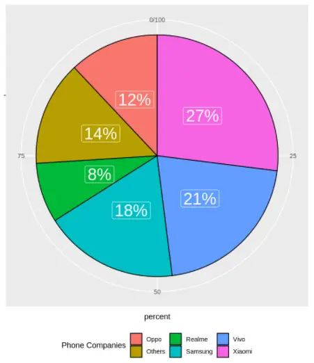
Example 10: Changing Legend Position
The legend can be placed at several places, possible placement values are “bottom”, “left”, “top” and “right” (default). To place the legend at the bottom use the legend.position = “bottom” in the theme layer.
ggplot(data, aes(x = "",y=percent, fill=brand)) +
geom_col(color = "black") +
geom_label(aes(label = paste0(percent, "%")), color = "white", position = position_stack(vjust = 0.5), size=8, show.legend = FALSE) +
coord_polar(theta = "y") +
guides(fill = guide_legend(title = "Phone Companies")) +
theme(legend.position = "bottom")
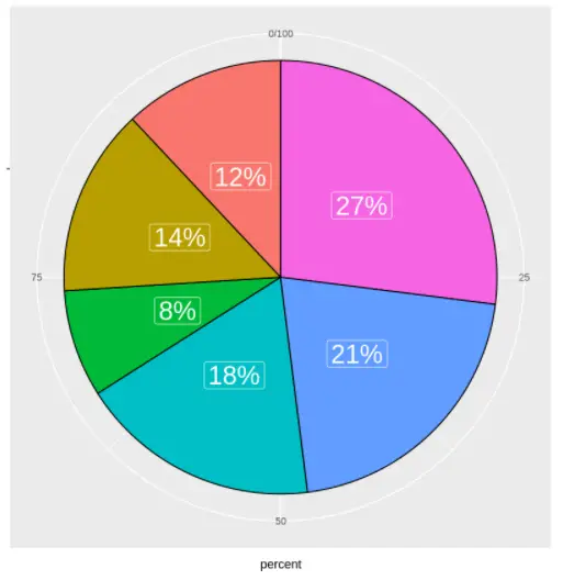
Example 11: Remove Legend from Pie Chart
If you want to remove the legend set legend.position = “none” in the theme layer.
ggplot(data, aes(x = "",y=percent, fill=brand)) +
geom_col(color = "black") +
geom_label(aes(label = paste0(percent, "%")), color = "white", position = position_stack(vjust = 0.5), size=8, show.legend = FALSE) +
coord_polar(theta = "y") +
guides(fill = guide_legend(title = "Phone Companies")) +
theme(legend.position = "none")
- Also Read – Tutorial for Bar Plot in ggplot2 with Examples