Introduction
In this article, we will go through the Seaborn line plot tutorial for your machine learning or data science projects. We will understand the syntax of the lineplot() function of the Seaborn library and see various examples for easy understanding of beginners. Let’s start the tutorial now.
Seaborn Line Plot Tutorial
Line plot is a very common visualization that helps to visualize the relationship between two variables by drawing the line across the data points.
There is a function lineplot() in Seaborn library that can be used to easily generate beautiful line plots. In the next section, we will see the syntax of lineplot() along with its different parameters
Syntax
seaborn.lineplot(*, x=None, y=None, hue=None, size=None, style=None, data=None, palette=None, hue_order=None, hue_norm=None, sizes=None, size_order=None, size_norm=None, dashes=True, markers=None, style_order=None, units=None, estimator=’mean’, ci=95, n_boot=1000, seed=None, sort=True, err_style=’band’, err_kws=None, legend=’auto’, ax=None, kwargs)**
x, y : vectors or keys in data
This parameter helps in specifying
hue : vector or key in data
The grouping based on hue will produce lines of different colors.
size : vector or key in data
The size parameter helps in producing lines of different sizes.
style : vector or key in data
This parameter can change the style of lines.
data : pandas.DataFrame, numpy.ndarray, mapping, or sequence
Here we provide the data for the visualization.
palette : string, list, dict, or matplotlib.colors.Colormap
This method helps in selecting colors for the plot.
sizes : list, dict, or tuple
This parameter sets the sizes for the size.
size_norm : tuple or Normalize object
Normalization in data units for scaling plot objects when the size variable is numeric.
dashes : boolean, list, or dictionary
This object determines the way in which lines will be drawn for several levels of style variable
markers : boolean, list, or dictionary
Here we determine the markers for different levels.
legend : “auto”, “brief”, “full”, or False
Here we specify the way in which the legend is displayed on the visualization.
ax : matplotlib.axes.Axes
Pre-existing axes for the plot. Otherwise, call matplotlib.pyplot.gca() internally.
Seaborn Line Plot Example
Let us now have a look at some examples of lineplot() in seaborn.
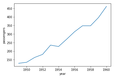
1st Example – Line Plot in Seaborn using Long-Form Data
In this example, we will use long-form data for creating a line plot in seaborn. Long-form data is the format in which variables of the dataset are represented by column and each observation is denoted by a row.
Here we will first load seaborn’s in-built dataset “flights” and then we fetch only April month data for our purpose.
After this, we call lineplot() function for plotting the line plot. We pass the x and y parameter as “years” and “passenger” respectively.
import seaborn as sns

flights = sns.load_dataset("flights")
flights.head()
Output:
| year | month | passengers | |
|---|---|---|---|
| 0 | 1949 | Jan | 112 |
| 1 | 1949 | Feb | 118 |
| 2 | 1949 | Mar | 132 |
| 3 | 1949 | Apr | 129 |
| 4 | 1949 | May | 121 |
apr_flights = flights.query("month == 'Apr'")
sns.lineplot(data=apr_flights, x="year", y="passengers")
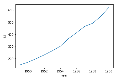
2nd Example – Line Plot in Seaborn using Wide-Form Data
In this second example, we will create a seaborn line plot using wide-form data. In wide-form format, data is laid down in a manner where both columns and rows consist of variables like a matrix form.
For converting our dataset into wide-form we will apply pivot and then use lineplot() to create the line plot.
flights_wide = flights.pivot("year", "month", "passengers")
flights_wide.head()
| month | Jan | Feb | Mar | Apr | May | Jun | Jul | Aug | Sep | Oct | Nov | Dec |
|---|---|---|---|---|---|---|---|---|---|---|---|---|
| year | ||||||||||||
| 1949 | 112 | 118 | 132 | 129 | 121 | 135 | 148 | 148 | 136 | 119 | 104 | 118 |
| 1950 | 115 | 126 | 141 | 135 | 125 | 149 | 170 | 170 | 158 | 133 | 114 | 140 |
| 1951 | 145 | 150 | 178 | 163 | 172 | 178 | 199 | 199 | 184 | 162 | 146 | 166 |
| 1952 | 171 | 180 | 193 | 181 | 183 | 218 | 230 | 242 | 209 | 191 | 172 | 194 |
| 1953 | 196 | 196 | 236 | 235 | 229 | 243 | 264 | 272 | 237 | 211 | 180 | 201 |
sns.lineplot(data=flights_wide["Jul"])
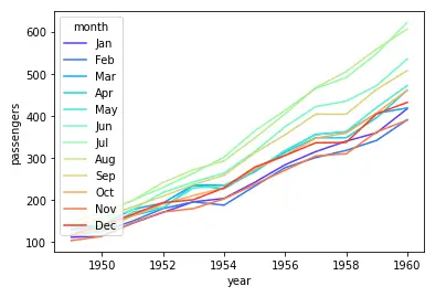
3rd Example – Passing entire long-form data and categorizing with Hue
In this example, we will pass the entire data to lineplot() function and use the hue parameter for categorization with month.
We also use the rainbow color palette to make categories more distinctively visible.
sns.lineplot(data=flights, x="year", y="passengers", hue="month", palette="rainbow")
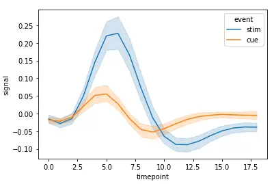
4th Example – Aggregation of Repeating Observations
In this current example, we are going to use another dataset of seaborn. Once we load that dataset, we pass data, x, y, and hue.
This dataset is used here because we want to visualize repeating observations.
fmri = sns.load_dataset("fmri")
fmri.head()
| subject | timepoint | event | region | signal | |
|---|---|---|---|---|---|
| 0 | s13 | 18 | stim | parietal | -0.017552 |
| 1 | s5 | 14 | stim | parietal | -0.080883 |
| 2 | s12 | 18 | stim | parietal | -0.081033 |
| 3 | s11 | 18 | stim | parietal | -0.046134 |
| 4 | s10 | 18 | stim | parietal | -0.037970 |
sns.lineplot(data=fmri, x="timepoint", y="signal", hue="event")
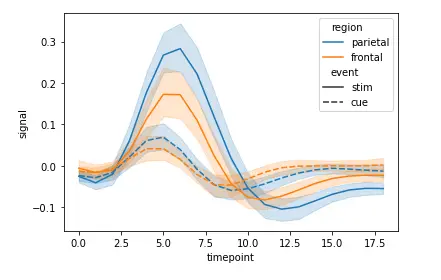
5th Example – Using Hue and Style to represent two different grouping variables
For this example, we can perform grouping based on multiple variables. To achieve this, we use both hue and style parameters.
According to the dataset, we get multiple variables, these can be visualized using the below method.
sns.lineplot(data=fmri, x="timepoint", y="signal", hue="region", style="event")
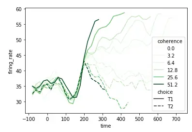
6th Example – Using a numeric variable for grouping with Hue
In this example, we’ll look at the way of grouping numeric variables.
We will import dataset for this purpose and then use the query function to access desired data.
At last, we call lineplot() function for creating the plot
dots = sns.load_dataset("dots").query("align == 'dots'")
dots.head()
sns.lineplot(
    data=dots, x="time", y="firing_rate", hue="coherence", style="choice",palette="Greens"
)
Conclusion
We have reached the end of this seaborn tutorial for line plot where we learned lineplot() function and its syntax. We also saw different examples of creating line plots by making use of various parameters and datasets.
Reference: https://seaborn.pydata.org/