Introduction
In this tutorial, we will show you how to make a Violin Plot in R using ggplot2, a popular and easy-to-use package for creating stunning graphs and visualizations in R. We will first understand the syntax and then cover multiple examples of creating violin plot for beginners to better understand.
Syntax of Violin Plot in ggplot2
In ggplot2, the minimal syntax for generating the violin plot is –
ggplot(<data>, mapping = aes(<mapping>)) + geom_violin()
You can further customize the violin plot by adding more layers such as themes, labs, etc.
Examples of Violin Plot in R using ggplot2
Loading Dataset
We will be reading the ‘ford.csv’ dataset into a data frame called df
df <- read.table("ford.csv",header=TRUE,sep=',')
options( warn = -1 )
head(df)
| model | year | price | transmission | mileage | fuelType | tax | mpg | engine size |
|---|---|---|---|---|---|---|---|---|
| Fiesta | 2017 | 12000 | Automatic | 15944 | Petrol | 150 | 57.7 | 1.0 |
| Focus | 2018 | 14000 | Manual | 9083 | Petrol | 150 | 57.7 | 1.0 |
| Focus | 2017 | 13000 | Manual | 12456 | Petrol | 150 | 57.7 | 1.0 |
| Fiesta | 2019 | 17500 | Manual | 10460 | Petrol | 145 | 40.3 | 1.5 |
| Fiesta | 2019 | 16500 | Automatic | 1482 | Petrol | 145 | 48.7 | 1.0 |
| Fiesta | 2015 | 10500 | Manual | 35432 | Petrol | 145 | 47.9 | 1.6 |
Loading ggplot2
library(ggplot2)
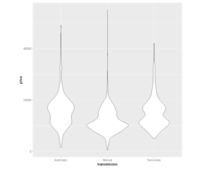
Example 1 – Basic Violin Plot in ggplot2
In the following example, we plot the most basic violin plot in ggplot2 with geom_violin() by passing the dataset along with the attribute mapping for x and y.
# Basic violin plot
ggplot(df, aes(x=transmission, y=price)) + geom_violin()
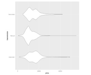
Example 2 – Horizontal Violin Plot in ggplot2
We can make a horizontal violin plot in ggplot2 by using the coord_flip() layer. In the following example, we are flipping the violin plot (that we created in the previous example) to horizontal.
ggplot(df, aes(x=transmission, y=price)) + geom_violin() + coord_flip()
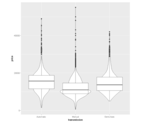
Example 3 – Violin Plot with Boxplot
At times it is useful to include a boxplot in the violin plot to get a clear idea of both the distribution of the data and its summary statistics. To achieve this, we can simply add a layer of geom_boxplot() along with geom_violin()
ggplot(df, aes(x=transmission, y=price)) + geom_violin()+ geom_boxplot()
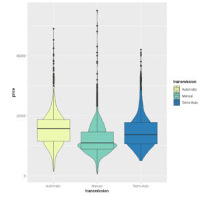
Example 4 – Add Color to Violin Plot with scale_fill_brewer()
Let us add color pallette to our Violin plot for which we are using scale_fill_brewer in this example.
ggplot(df, aes(x=transmission, y=price,fill=transmission))+ geom_violin() + geom_boxplot()+ scale_fill_brewer(palette="YlGnBu")
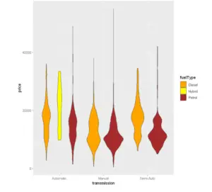
Example 5 – Add Manual Color to Violin Plot with scale_fill_manual()
ggplot(df, aes(x=transmission, y=price,fill=fuelType)) + geom_violin() + scale_fill_manual(values=c("orange", "yellow", "brown"))
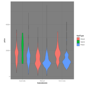
Example 6 – Adding Themes to the Violin Plot
Now let us customize our Violin Plot using different themes, we will be implementing the theme_void() and theme_dark() function for this purpose
ggplot(df, aes(x=transmission, y=price,fill=fuelType)) + geom_violin() +
theme_void()
Using the dark theme:
ggplot(df, aes(x=transmission, y=price,fill=fuelType)) + geom_violin() +
theme_dark()
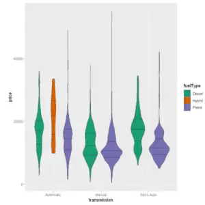
Example 7 – Adding Quantiles to the Violin Plot
Here’s how we use the quantiles parameter to add quantiles to a violin plot:
ggplot(df, aes(x=transmission, y=price,fill=fuelType))+ geom_violin(draw_quantiles = c(.25, .50, .75))+scale_fill_brewer(palette="Dark2")
Example 8 – Plot stat_summary
Now, let’s use the function stat_summary() can be used to add mean/median points and more on a violin plot.
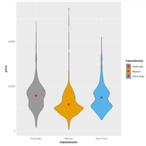
ggplot(df, aes(x=transmission, y=price,fill=transmission))+
  geom_violin() +
  stat_summary(fun = "mean",
               geom = "point",
               color = "red",size=3) +scale_fill_manual(values=c("#999999", "#E69F00", "#56B4E9"))
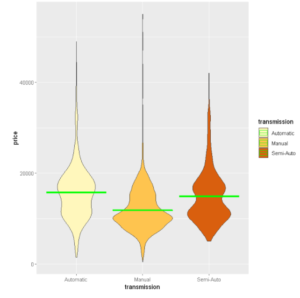
Using crossbar instead of dot to display mean
ggplot(df, aes(x=transmission, y=price,fill=transmission)) +
  geom_violin() +
  stat_summary(fun = "mean",
               geom = "crossbar",
               color = "green")+ scale_fill_brewer(palette="YlOrBr")
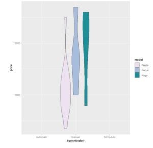
Example 9: Organise by Group
This is a grouped violin plot with a separate violin plot for each car model type present in our dataset.
ggplot(head(df,n=30), aes(x=transmission, y=price,fill=model))+
  geom_violin()+ scale_fill_brewer(palette="PuBuGn")
- Also Read – Tutorial for Histogram in R using ggplot2 with Examples
- Also Read – Learn Scatter Plot in R using ggplot2 with Examples
- Also Read – Tutorial for Line Plot in R using ggplot2 with Examples