Introduction
In this article, we will take you through the tutorial for Heatmap using ggplot2 which is a commonly used package for creating beautiful visualizations in R. We will first understand the syntax and then see different types of examples of heatmap with ggplot2.
Syntax of Heatmap in ggplot2
The minimal syntax for generating the heatmap in ggplot2
ggplot(<data>, mapping = aes(<mapping>)) + geom_tile()
We can also customize the heatmap by adding more layers such as themes, labs, etc.
Examples of Heatmap in R using ggplot2
Preparing the Dataset
For all the examples of heatmap in ggplot2, we will use the ‘heart.csv’ dataset.
into a data frame called df
df <- read.table("heart.csv",header=TRUE,sep=',')
head(df)
| ï..age | sex | cp | trestbps | chol | fbs | restecg | thalach | exacting | old peak | slope | ca | thal | target |
|---|---|---|---|---|---|---|---|---|---|---|---|---|---|
| 63 | 1 | 3 | 145 | 233 | 1 | 0 | 150 | 0 | 2.3 | 0 | 0 | 1 | 1 |
| 37 | 1 | 2 | 130 | 250 | 0 | 1 | 187 | 0 | 3.5 | 0 | 0 | 2 | 1 |
| 41 | 0 | 1 | 130 | 204 | 0 | 0 | 172 | 0 | 1.4 | 2 | 0 | 2 | 1 |
| 56 | 1 | 1 | 120 | 236 | 0 | 1 | 178 | 0 | 0.8 | 2 | 0 | 2 | 1 |
| 57 | 0 | 0 | 120 | 354 | 0 | 1 | 163 | 1 | 0.6 | 2 | 0 | 2 | 1 |
| 57 | 1 | 0 | 140 | 192 | 0 | 1 | 148 | 0 | 0.4 | 1 | 0 | 1 | 1 |
We use the cor() function to calculate the correlation between two vectors, this, in turn, generates a correlation matrix of the dataset for us
cormat <- round(cor(df),2)
head(cormat)
| ï..age | sex | cp | trestbps | chol | fbs | restecg | thalach | exang | oldpeak | slope | ca | thal | target | |
|---|---|---|---|---|---|---|---|---|---|---|---|---|---|---|
| ï..age | 1.00 | -0.10 | -0.07 | 0.28 | 0.21 | 0.12 | -0.12 | -0.40 | 0.10 | 0.21 | -0.17 | 0.28 | 0.07 | -0.23 |
| sex | -0.10 | 1.00 | -0.05 | -0.06 | -0.20 | 0.05 | -0.06 | -0.04 | 0.14 | 0.10 | -0.03 | 0.12 | 0.21 | -0.28 |
| cp | -0.07 | -0.05 | 1.00 | 0.05 | -0.08 | 0.09 | 0.04 | 0.30 | -0.39 | -0.15 | 0.12 | -0.18 | -0.16 | 0.43 |
| trestbps | 0.28 | -0.06 | 0.05 | 1.00 | 0.12 | 0.18 | -0.11 | -0.05 | 0.07 | 0.19 | -0.12 | 0.10 | 0.06 | -0.14 |
| chol | 0.21 | -0.20 | -0.08 | 0.12 | 1.00 | 0.01 | -0.15 | -0.01 | 0.07 | 0.05 | 0.00 | 0.07 | 0.10 | -0.09 |
| fbs | 0.12 | 0.05 | 0.09 | 0.18 | 0.01 | 1.00 | -0.08 | -0.01 | 0.03 | 0.01 | -0.06 | 0.14 | -0.03 | -0.03 |
Using the reshape2 library, we can subsequently use the melt function to convert our data frame into the long format and to stretch the data frame. This transformed dataset will be used in all the subsequent examples.
library(reshape2)
melted_cormat <- melt(cormat)
head(melted_cormat)
| Var1 | Var2 | value |
|---|---|---|
| ï..age | ï..age | 1.00 |
| sex | ï..age | -0.10 |
| cp | ï..age | -0.07 |
| trestbps | ï..age | 0.28 |
| chol | ï..age | 0.21 |
| fbs | ï..age | 0.12 |
Loading ggplot2
library(ggplot2)
Example 1: Basic Heatmap in ggplot2
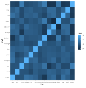
The basic heatmap in ggplot2 is created by using geom_tile() layer as shown in the below example.
ggplot(data = melted_cormat, aes(x=Var1, y=Var2, fill=value)) +
  geom_tile()
Example 2: Scale_fill_gradient in Heatmap
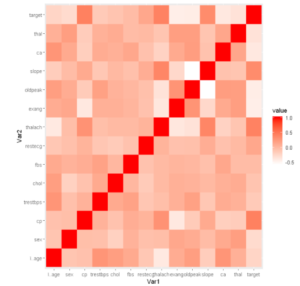
The Scale_fill_gradient is used to add the color gradient to the heatmap plot. It has got to parameters namely high and low to assign the gradient scale.
ggplot(data=melted_cormat,aes(x = Var1, y = Var2, fill = value))+
geom_tile()+scale_fill_gradient(high = "red", low = "white")
Example 3: Adding Title to the Heatmap
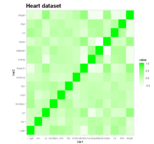
Let us add a title to our heatmap to give it more description. We can do this by using ggtitle().
ggplot(data=melted_cormat,aes(x = Var1, y = Var2, fill = value))+
geom_tile()+scale_fill_gradient(high = "green", low = "white") +
ggtitle("Heart dataset")+ theme(plot.title = element_text(size = 20, face = "bold"))
Example 4: Visualize the correlation using Heatmap
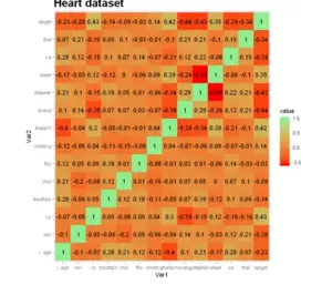
Each cell here depicts the relationship between the intersecting variables, such as a linear correlation. This plot helps analysts understand relationships between variables while descriptive or predictive statistical models.
ggplot(data=melted_cormat,aes(x = Var1, y = Var2, fill = value))+
geom_tile()+scale_fill_gradient(high = "green", low = "red")+
ggtitle("Heart dataset")+
theme(plot.title = element_text(size = 20, face = "bold"))+
geom_text(aes(label = round(value, 3)))+
scale_fill_continuous(low = "red", high = "lightgreen")
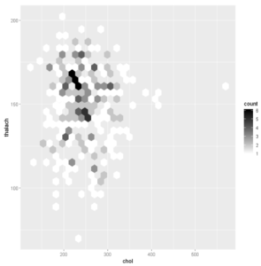
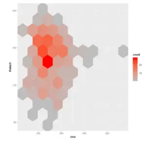
Add hexagon binding The function geom_hex() produces a scatter plot with hexagon binning. The hexbin R package is required for hexagon binning. If you don’t have it, use the R code below to install using require(hexbin).
# Default plot
ggplot(df,aes(chol,thalach))+ geom_hex()
# Change the number of bins
ggplot(df,aes(chol,thalach)) + geom_hex(bins = 10)
Example 6: Add heatmap of 2d bin counts
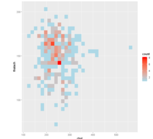
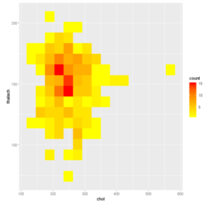
The function geom_bin2d() produces a scatter plot with rectangular bins. The number of observations is counted in each bin and displayed as a heatmap.
# Default plot
ggplot(df,aes(chol,thalach)) + geom_bin2d()
# Change the number of bins
ggplot(df,aes(chol,thalach)) + geom_bin2d(bins = 15)
- Also Read – Heatmap in Python Matplotlib
- Also Read – Heatmap in Python Seaborn
-
I am passionate about Analytics and I am looking for opportunities to hone my current skills to gain prominence in the field of Data Science.
View all posts


