Introduction
In this article, we’ll go tutorial of Seaborn Heatmap function sns.heatmap() that will be useful for your machine learning or data science projects. We will learn about its syntax and see various examples of creating Heatmap using the Seaborn library for easy understanding for beginners.
Seaborn Heatmap Tutorial
Heatmap is a visualization that displays data in a color encoded matrix. The intensity of color varies based on the value of the attribute represented in the visualization.
In Seaborn, the heatmap is generated by using the heatmap() function, the syntax of the same is explained below.
Syntax for Seaborn Heatmap Function : heatmap()
seaborn.heatmap(data, *, vmin=None, vmax=None, cmap=None, center=None, robust=False, annot=None, fmt=’.2g’, annot_kws=None, linewidths=0, linecolor=’white’, cbar=True, cbar_kws=None, cbar_ax=None, square=False, xticklabels=’auto’, yticklabels=’auto’, mask=None, ax=None, kwargs)**
Parameters Information
- data : rectangular dataset
Here we provide the data for plotting the visualization. - vmin, vmax : floats, optional
This parameter is used for for anchoring colormap. - cmap : matplotlib colormap name or object, or list of colors, optional
The cmap parameter is used for mapping data values. - center : float, optional
This parameter helps in changing the center position of heatmap. - annot : bool or rectangular dataset, optional
This helps in annotating the heatmap with values if set to True, otherwise values are not provided. - linewidths : float, optional
We can set the width of the lines that divide the cells - linecolor : color, optional
This helps in setting the color of each line that divides heatmap cells. - cbar : bool, optional
With this parameter, we can either set the color bar or not. - square : bool, optional
Through this parameter, we can ensure that each cell is made up of equal square-shaped cell. - xticklabels, yticklabels : “auto”, bool, list-like, or int, optional
Here we can plot the column names in the visualization, if passed as True. - ax : matplotlib Axes, optional
Here we specify the axes on which the plot is drawn.
Following this, we’ll look at different examples of creating heatmap using the seaborn library.
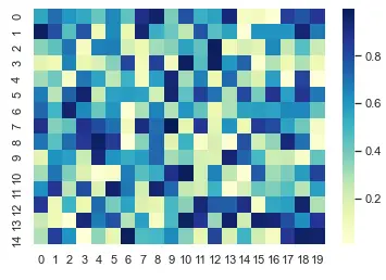
1st Example – Simple Seaborn Heatmap
In this 1st example, we will generate the data randomly using the NumPy array and then pass this data to the heatmap() function.
First of all, we have to import the NumPy library, seaborn library, and also set the theme using the seaborn library.
import numpy as np

np.random.seed(0)

import seaborn as sns

sns.set_theme()

uniform_data = np.random.rand(15, 20)

ax = sns.heatmap(uniform_data, cmap="YlGnBu")
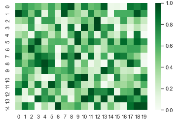
2nd Example – Applying Color Bar Range
In this example, we are using the same data as in 1st example, but this time we pass the vmin and vmax parameters to set the color bar range. We have restricted the color bar range from 0 to 1.
ax = sns.heatmap(uniform_data, vmin=0, vmax=1, cmap="Greens")
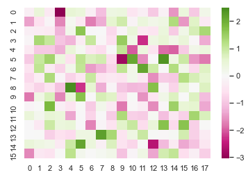
3rd Example – Plotting heatmap with Diverging Colormap
The 3rd example showcases the implementation of a heatmap that has diverging colormap. This means the center of the data is at ‘0’. As we can see in the visualization, the values above and below ‘0’ have different shades of color.
normal_data = np.random.randn(16, 18)

ax = sns.heatmap(normal_data, center=0, cmap="PiYG")
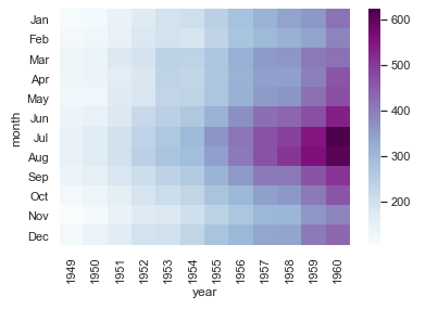
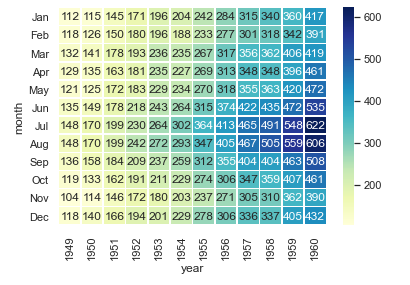
4th Example – Labelling the rows and columns of heatmap
The current example will use one of the in-built datasets of seaborn known as flights dataset. We load this dataset and then we create a pivot table using three columns of the dataset.
After this, we are using sns.heatmap() function to plot the heatmap.
flights = sns.load_dataset("flights")

flights = flights.pivot("month", "year", "passengers")

ax = sns.heatmap(flights, cmap="BuPu")
5th Example – Annotating the Heatmap
In this example, we look at the way through which annotation of cells can be done with values of each cell displayed in it. Along with this, rows and columns are also labeled.
For annotation, we are using fmt parameter. With the help of this parameter, we can not just add numeric values but also textual strings. We also have the option of using annot parameter but it does not allow to add strings.
We can also alter the width of lines dividing each cell in the heatmap.
ax = sns.heatmap(flights, annot=True, fmt="d", cmap="YlGnBu", linewidths=.6)
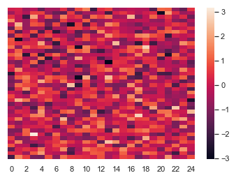
6th Example – Heatmap without labels
This example shows how we can build a heatmap without rows. Here we have generated random data using NumPy’s random function.
For creating a heatmap without labels, we have to mark xticklabels and yticklabels parameters as False.
In this example, we pass False in yticklabels parameter for plotting heatmap without labels on the y-axis.
data = np.random.randn(40, 25)

ax = sns.heatmap(data, xticklabels=2, yticklabels=False)
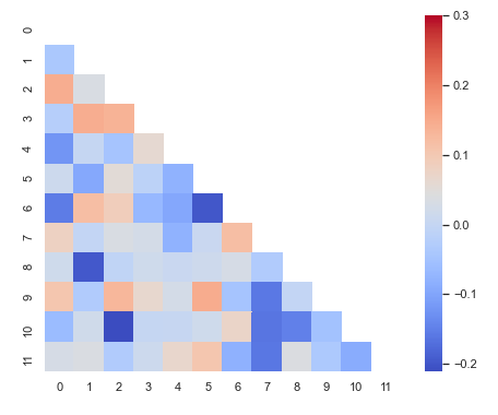
7th Example – Diagonal Heatmap with Masking in Seaborn
This last example will show how we can mask the heatmap to suppress duplicate part of the heatmap. First of all, we build correlation coefficient with the help of the NumPy random function. After this, we use zeros_like function of NumPy for creating a mask.
Then, we create a triangular mask with the help of triu_indices_from and pass True for building the same.
At last, we use the subplots function for specifying the size of the plot. We pass our custom created mask to mask parameter. Also, the square parameter is used for creating square cells.
import matplotlib as plt

corr = np.corrcoef(np.random.randn(12, 150))

mask = np.zeros_like(corr)

mask[np.triu_indices_from(mask)] = True

with sns.axes_style("white"):

    f, ax = plt.pyplot.subplots(figsize=(8, 6))

    ax = sns.heatmap(corr, mask=mask, vmax=.3, square=True, cmap="coolwarm")
Conclusion
This is the end of this seaborn tutorial, in this, we looked at the syntax of the seaborn heatmap function and different examples. We also learned about the parameters of sns.heatmap() function that is used for various purposes while plotting heatmaps.
Reference: https://seaborn.pydata.org/