Introduction
In this article, we will go through the Seaborn boxplot tutorial for your machine learning or data science projects. We will understand the syntax of the boxplot() function of the Seaborn library and understand various examples for easy understanding of beginners. Let’s start the tutorial now.
Seaborn Boxplot Tutorial
Boxplot is also known as box-and-whisker plot and is used to depict the distribution of data across different quartiles. It is a very useful visualization during the exploratory data analysis phase and can help to find outliers in the data.
Seaborn library has a function boxplot() to create boxplots with quite ease. Let us have a look at its syntax below.
Syntax of Seaborn Boxplot()
seaborn.boxplot(*, x=None, y=None, hue=None, data=None, order=None, hue_order=None, orient=None, color=None, palette=None, saturation=0.75, width=0.8, dodge=True, fliersize=5, linewidth=None, whis=1.5, ax=None, kwargs)**
x, y, hue : names of variables in data or vector data, optional
This contains the variables used for visualization.
data : DataFrame, array, or list of arrays, optional
Here we provide the data that can be used for plotting purposes.
orient : “v” | “h”, optional
This decides the way our plot will be oriented, either it can be horizontal or vertical.
color : matplotlib color, optional
Using this parameter, we can specify the color of our plot elements.
palette : palette name, list, or dict
This parameter also helps in setting the color for plot.
width : float, optional
We can set the width of a plot using this parameter.
fliersize : float, optional
This parameter helps in determining the markers size for outlier observations.
linewidth : float, optional
For setting the linewidth of the plot, we can use this parameter.
whis : float, optional
The whiskers for the box plot are decided through this parameter.
ax : matplotlib Axes, optional
Lastly, the axes on which the plot is plotted will be specified.
kwargs : key, value mappings
This parameter takes the keyword arguments for this function.1st Example – Horizontal Boxplot in Seaborn
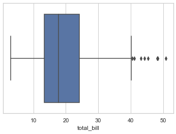
The first example is a horizontal box plot that is created using one of the in-built Tips datasets of seaborn.
We pass the “total_bill” field of the dataset in the x parameter which then generates the horizontal box plot.
The box in the middle shows the spread of data, the whiskers express maximum and minimum values. Lastly, the dots represent outliers.
import seaborn as sns

sns.set_theme(style="whitegrid")

tips = sns.load_dataset("tips")

ax = sns.boxplot(x=tips["total_bill"])
2nd Example – Vertical Boxplot in Seaborn
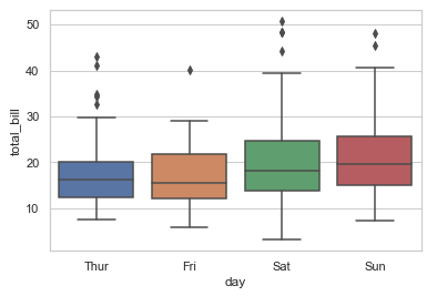
The 2nd type of boxplot is showing how to build a vertical box plot.
For this, we mention both x and y variables. Apart from this, the dataset is passed to the data parameter.
We get a boxplot for each value of x i.e. day in the final visualization.
ax = sns.boxplot(x="day", y="total_bill", data=tips)
3rd Example – Seaborn Boxplot with Color Palette
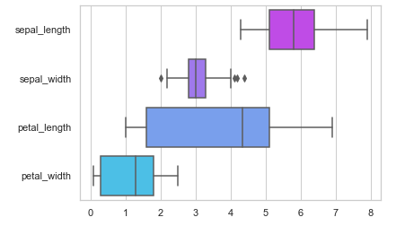
In this example, we will use a color palette to give colors to the boxplots. For this purpose, we use the palette parameter of the boxplot() function. Here we have provided “cool_r” palette to the function.
iris = sns.load_dataset("iris")

ax = sns.boxplot(data=iris, orient="h", palette="cool_r")
4th Example – Groupby of Boxplot with hue
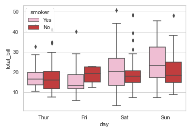
Here we will show how we can perform groupby of categorical variables using the hue parameter of boxplot() of seaborn.
In our example here, we have groupby the dataset by passing “sex” attribute to the hu parameter. Here, we have also used legends to distinguish between variables in our boxplot.
ax = sns.boxplot(x="day", y="total_bill", hue="smoker",
                 data=tips, palette="tab20_r")
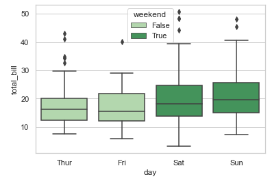
5th Example – Groupby of Boxplot with hue
The current example will show how we can categorize the box plots on the basis of hue.
tips["weekend"] = tips["day"].isin(["Sat", "Sun"])

ax = sns.boxplot(x="day", y="total_bill", hue="weekend",
                 data=tips, dodge=False, palette="Greens")
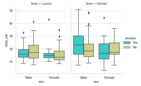
6th Example – Multiple Box Plots with seaborn catplot()
For building multiple box plots, we will use catplot() function of Seaborn. Here we pass the “time” variable to the col parameter of the catplot() function.
g = sns.catplot(x="sex", y="total_bill",

                hue="smoker", col="time",

                data=tips, kind="box",

                height=4, aspect=.7, palette="rainbow")
Conclusion
This tutorial gave us an in-depth look at the seaborn boxplot where we looked at the syntax of the boxplot() function. In addition to all of this, we saw various examples of how we can build different types of box plots using seaborn. In the end, we also saw an example of catplot() function for creating multiple boxplot visualization.
Reference: https://seaborn.pydata.org/