Introduction
In this tutorial, we will see how to create Violin Plot in Base R language which is very popular for providing packages for rich visualization. First, we will understand the syntax of vioplot() and then see how to use it for creating violin plot.
Syntax of Violin Plot vioplot() function in R
The basic syntax for vioplot() function is shown below with a few commonly used arguments. The detailed syntax can be found here.
vioplot(x,horizontal,col,rectCol,lineCol,colMed,border)
- x – It denotes the data using which violin plot has to be created.
- horizontal – Signifies whether the violin plot is to be created horizontally or not.
- col – Controls the color of the violin plot.
- rectCol – Controls the fill color of the rectangle box.
- lineCol – Controls the line color of the rectangle box and its whiskers.
- colMed – Controls the color of the median point.
- border– Controls the color of the border of the violin plot.
Examples of Violin Plot in R Language
Dataset
We will use the Tips datasets for all the Violin plot examples in R language. The tips dataset is relatively small consisting of only 244 rows and 7 variables which shows the data of tip given by customers to the waiter.
Let us load this data into a data frame and see what it looks like.
df <- read.table("tips.csv",header=TRUE,sep=',')
head(df)
| total_bill | tip | sex | smoker | day | time | size |
|---|---|---|---|---|---|---|
| 16.99 | 1.01 | Female | No | Sun | Dinner | 2 |
| 10.34 | 1.66 | Male | No | Sun | Dinner | 3 |
| 21.01 | 3.50 | Male | No | Sun | Dinner | 3 |
| 23.68 | 3.31 | Male | No | Sun | Dinner | 2 |
| 24.59 | 3.61 | Female | No | Sun | Dinner | 4 |
| 25.29 | 4.71 | Male | No | Sun | Dinner | 4 |
x<-df['total_bill']
Example 1: Basic Violin Plot in Base R
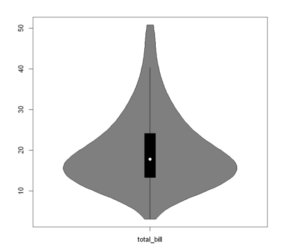
We will start with a very basic violin plot in R, by passing the data to the vioplot function.
library("vioplot")

vioplot(x)
Example 2: Horizontal Violin Plot in R
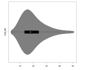
Under default setting, the vioplot function will create a vertical violin plot in R, however, if we want to plot a horizontal Violin Plot, we can set the horizontal argument to TRUE.
vioplot(x, horizontal = TRUE)
Example 3: Add Color and Median point
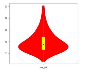
To color our Violin plot we shall use the col argument, while to add color to the box plot rectangle we will use the rectCol argument. Finally, we can color the median point as well using the colMed argument.
vioplot(x,
        col = 2,
        rectCol = "yellow",
        lineCol = "white",
        colMed = "blue",
        border = "black",
        pchMed = 16,
        plotCentre = "points")
Example 4: Grouping in Violin Plot
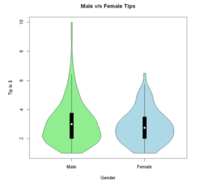
Grouped Violin plots display the distribution of categorical variables for specific groups or subgroups. Here, in the example below we do group by ‘sex’.
vioplot(df$tip[df$sex=="Male"], df$tip[df$sex=="Female"],
        names=c("Male","Female"), main = "Male v/s Female Tips",
        xlab="Gender",ylab ="Tip in $", col=c("lightgreen", "lightblue"))
Example 5: Violin Plot with Legend
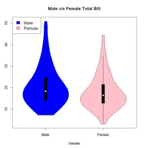
To add to the aesthetics of our graph we can add a legend by using the legend function. Furthermore, we can customize its position, legend titles, fill colors, and size of the text as shown in the below example.
vioplot(df$total_bill[df$sex=="Male"], df$total_bill[df$sex=="Female"], names=c("Male","Female"), main = "Male v/s Female Total Bill", xlab="Gender",ylab ="Tip in $", col=c("blue", "pink"))
legend("topleft", legend=c("Male","Female"), fill=c("blue", "pink"), cex = 1.2)
Example 6: Reordering Violin plots by Median
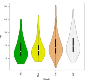
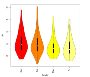
By default, the violin plots are ordered by the levels of the categorical variable. However, we can reorder the categorical variable by any characteristic of the dataset with the reorder function. Let us now see two examples where we will reorder the Violin plots by the ascending and descending order of Median values.
In Ascending order of Median Value
levels(df$day)
medians <- reorder(df$day, df$total_bill, median)

vioplot(df$total_bill ~ medians, col = terrain.colors(4),
        xlab = "Gender", ylab = "tip", las = 2)
In Descending order of Median Value
medians <- reorder(df$day, -df$total_bill, median)

vioplot(df$total_bill ~ medians, col =heat.colors(4),
        xlab = "Gender", ylab = "tip", las = 2)
Example 7: Split R Vioplots
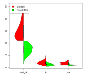
Suppose we want to divide our Tips dataset into two distinct groups based on the total bill expenses, which represent small and big bills(based on some threshold value we set). We can make use of the side and add arguments for this purpose.
big<- df[df$total_bill >= 22, ]
small <- df[df$total_bill <22, ]

vioplot(big, side = "left", plotCentre = "line", col = 'red')
vioplot(small, side = "right", plotCentre = "line", col ='green', add = TRUE)

legend("topleft", legend = c("Big Bill", "Small Bill"), fill = c(2, 3), cex = 1.25)
-
I am passionate about Analytics and I am looking for opportunities to hone my current skills to gain prominence in the field of Data Science.
View all posts


