Introduction
In this article, we’ll go through the tutorial for the Seaborn Bar Plot for your machine learning and data science projects. We will look at the syntax of the sns.barplot() function of Seaborn and see examples of using this function for creating bar plots in different ways by playing around with its parameters.
Seaborn Bar Plot Tutorial
A bar plot is one of the most common graphs useful to represent the numeric aggregation of data by rectangular bars for different categories. For example, the revenue of a company across different quarters can be visually represented by a bar plot.
barplot() function is Seaborn library can be used to create beautiful bar plots with minimal coding. In the following section, we’ll look at the syntax of barplot() along with the explanation of each parameter.
Syntax for sns.barpot()
seaborn.barplot(x=None, y=None, hue=None, data=None, order=None, hue_order=None, ci=95, n_boot=1000, units=None, seed=None, orient=None, color=None, palette=None, saturation=0.75, errcolor=’.26′, errwidth=None, capsize=None, dodge=True, ax=None, kwargs)**
x, y, hue : names of variables in data or vector data, optional
In this variable, we provide the inputs to the function.data : DataFrame, array, or list of arrays, optional
Here the dataset or dataframe for plotting bar plot is passed.
order, hue_order : lists of strings, optional
This is the order for plotting categorical variables.estimator : callable that maps vector -> scalar, optional
This statistical function is used to determine the categorical bin.
orient : “v” | “h”, optional
Here we can decide whether the plot has to be vertical or horizontal.
color : matplotlib color, optional
The color of all elements are determined by this parameter.
palette : palette name, list, or dict
This parameter determines the colors used in plots.
ax : matplotlib Axes, optional
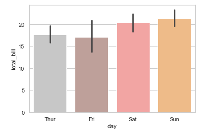
This is the axes on which the visualization is plotted.Example 1 – Seaborn Bar Plot for Categorical Variable
In this first example, we will be plotting a seaborn bar plot with the help of categorical variable.
First, we import seaborn library. Then, we set the theme for the plot and then load the dataset for plotting the visualization.
After this, we call the barplot() function of the seaborn library.
For altering the color of bar plots, we can use a palette parameter in which we can pass numerous values.
import seaborn as sns

sns.set_theme(style="whitegrid")

tips = sns.load_dataset("tips")

ax = sns.barplot(x="day", y="total_bill", data=tips, palette="tab20_r")
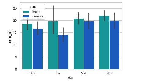
Example 2 – Seaborn Bar Plot with Multiple Columns
This example will show how we can group two different variables into multiple columns of a bar plot in seaborn.
For this example, we are using the hue parameter to create multiple columns grouped by subcategories. In our example, the bar plot has been subcategorized into multiple columns on the basis of “sex”.
ax = sns.barplot(x="day", y="total_bill", hue="sex", data=tips, palette="winter_r")
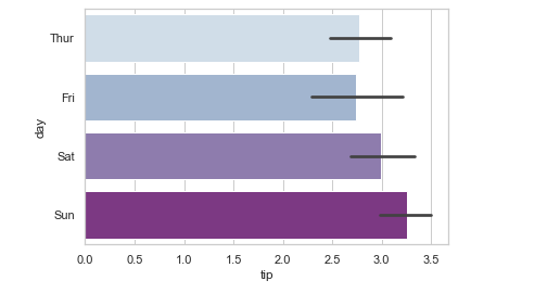
Example 3 – Horizontal Bar Plot
Till now we looked at examples of bar plots that were vertical, but now in this example, we’ll see how to build a horizontal bar plot using Seaborn. Here we have swapped the axes for creating the horizontal plot by using ‘day’ for the x-axis and ‘tip’ for the y-axis.
ax = sns.barplot(x="tip", y="day", data=tips, palette="BuPu")
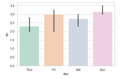
Example 4 – Bar Plot with Estimator Median
In this fourth example, we are using the median as an estimator for plotting the bar chart. For this, we use the estimator parameter in barplot().
from numpy import median

ax = sns.barplot(x="day", y="tip", data=tips, estimator=median,palette="Pastel2")
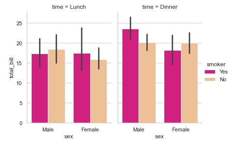
Example 5 – Multiple Bar Plots with Seaborn catplot()
Now we’ll learn how to build multiple bar plots. For this purpose, we are using seaborn catplot() function. Here we pass the attributes for x-axis and y-axis. Then, we pass parameters like hue, col for the bar plot.
Then we pass data, height, and aspect. We also pass kind and aspect parameters.
g = sns.catplot(x="sex", y="total_bill",

                hue="smoker", col="time",

                data=tips, kind="bar",

                height=4, aspect=.7, palette="Accent_r" );
- Also Read – 11 Python Data Visualization Libraries Data Scientists should know
- Also Read – Matplotlib Bar Plot – Complete Tutorial For Beginners
Conclusion
It’s time to end this tutorial, in this we learned about different types of seaborn bar plots using sns.barpot() function. We learned various examples of creating bar plots in the seaborn library. In the end, we also saw how to use catplot() function creating multiple bar plots in seaborn.
Reference: https://seaborn.pydata.org/