Introduction
Every time when we try to solve a data science problem, our aim is to extract as much insight as possible from the data. This also involves deriving the relationship between two different attributes or features of a dataset and traditionally Correlation Matrix is widely used for this purpose. However, there are instances when the correlation matrix is not very effective to convey all hidden insights of the data. To overcome this shortcoming, there is a new method of Predictive Power Score which has started to gain popularity.
In this article, we will understand what is predictive power score and see its implementation in Python. We will also do a comparison between predictive power score vs correlation and understand its pros and cons.
What is a Predictive Power Score?
Predictive Power Score or PPS is a kind of score that is asymmetric and data-type agnostic and helps in identifying linear or non-linear relationships between two columns of a particular dataset. The value spectrum of PPS lies between 0 (no predictive power) and 1 (highest predictive power).
Through PPS we can figure out how useful a variable would be in predicting the values of another variable in a given dataset and since it normalizes the data it is much more reliable.
Generally, a PPS score near 1 (e.g 0.8) is considered as good and this tells us that a given column A is very likely to predict the values of column B.
Whereas if the PPS score lies on the lower side near 0 (e.g. 0.3), then we may have to reconsider our comparisons as column A may not be useful to predict the values of column B.
Predictive Power Score vs Correlation
i) Correlation
The correlation matrix produces output between -1 to 1 using which we can easily find linear relationships that are quite stronger, in both positive and negative directions.
Still, there are areas where the correlation matrix fails to produce desirable results. Instances where columns have non-linear relationships go undetected by the correlation matrix. Interestingly, the correlation matrix would produce a score of 0 in such scenarios, trying to convey that “I didn’t find anything useful here”.
Moreover, the correlation matrix can only handle columns that consist of numerical data, it simply neglects other kinds of values namely categoric, nominal, etc.
Another drawback is the correlation matrix is symmetrical, which can give a misleading interpretation that the correlation of column A to B and B to A is same. But this is not always the case in the real world.
ii) Predictive Power Score (PPS)
- PPS can very well find out non-linear relationships amongst different columns which cannot be obtained from correlation.
- The correlation matrix works only with numerical variables but PPS can also handle categorical and nominal data as well, in addition to numerical values.
- Unlike the correlation matrix, PPS is asymmetric. This simply means that if column A can predict column B values, it does not mean that column B can also predict column A values, and PPS will show this interpretation.
[adrotate banner=”3″]
Disadvantages of Predictive Power Score
In spite of all the pros of PPS, there are some cons that make it tough to work with. Let’s go over these cons and understand what are the problems encountered.
- Since PPS is relatively new as compared to the correlation matrix, the predictive power score can be tedious and hard to draw inferences.
- The PPS can reflect different types of relationships on a single score, this can give rise to complex patterns.
- Contrary to the correlation matrix, the predictive power score can have different methods i.e. different algorithms and evaluation metrics for producing the output, thus making the results highly dependent on several factors. This may generate undesirable results.
- Predictive Power Score generates the output in more time as compared to the correlation matrix.
Steps for Predictive Power Score Calculation
1. Choosing the Algorithm
By default, the predictive power score method uses a Decision Tree for calculating the results. There are many reasons for choosing the Decision Tree algorithm.
- Firstly, the Decision Tree can find out any sort of non-linear bivariate relationships.
- Decision Tree is applicable in numerous cases and also it requires very little data preprocessing.
- Furthermore, Decision Tree is able to handle outliers very well and rarely overfits, thus making it highly robust.
2. Deciding the Implementation Method
As we know that the predictive power score can work with numerical and categorical values in the target column. We will also have to choose the supervised learning method that will be used for performing predictions.
- When dealing with categorical values, we will be using the Decision Tree Classifier.
- When deadline with numerical values, we should use Decision Tree Regressor.
If in case you are looking to use some other algorithm in place of Decision Tree, then you’ll have to implement the classifier and regressor using that particular algorithm.
3. Preprocessing the data
Earlier in the article, we had discussed that Decision Tree does not require preprocessing but there are instances when we have to perform some kind of data preprocessing and feature selection for generating better results.
Again based on the type of values, we choose the evaluation metric method.
- If the column whose values are to be predicted a.k.a. the target column has categorical values, we use Label Encoding.
- But if the column which is predicting the values a.k.a. the feature column has categorical values, we use one-hot encoding.
4. Finalizing the Evaluation Metric
Now on the basis of the supervised learning method chosen, we also to finalize the evaluation metric for our score.
So if the method which is chosen is the classification method, then we’ll be using the weighted F1 score as an evaluation metric. This score is basically a weighted average of precision and recall. In predictive power score, we first calculate the F1 score for the naive model (the model that always predicts the most common class) and after this, with the help of the F1 score generated, we obtain the actual F1 score for the predictive power score.
The F1 score lies between the range of 0 to 1. The higher the better it is.
Following is the mathematical formula used in this case:
Here the score lies between 0 and 1 but as this score tells us about the error component, the lower it is, the better it will be. The mathematical formula used for calculating the MAE is mentioned below.
Predictive Power Score in Python
In section, we will implement Predictive Power Score in Python and will also compare its results with the correlation matrix. We will calculate the predictive power score and correlation for columns of a given dataset.
i) Installing ppscore library for Predictive Power Score
If ppscore library is not present, you can install it using the following line at the command prompt.
- pip install ppscore
ii) Loading the libraries
Here we will be loading the pandas, seaborn and predictive power score library (ppscore).
import pandas as pd
import seaborn as sns

import ppscore as pps
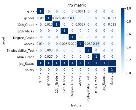
iii) Create heatmap for PPS matrix
For better interpretation, we will have to visualize the results of the predictive power score matrix. For this purpose, we will write a function to create a heatmap.
def heatmap(df):
    ax = sns.heatmap(df, vmin=0, vmax=1, cmap="Blues", linewidths=0.5, annot=True)
    ax.set_title('PPS matrix')
    ax.set_xlabel('feature')
    ax.set_ylabel('target')
    return ax
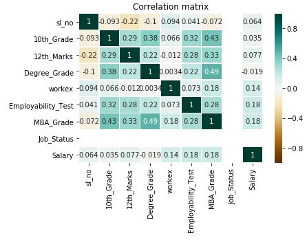
iv) Create a heatmap for correlation matrix
Similarly, we will have to visualize the results of correlation matrix and for this purpose, we write another function to create a heatmap by calling the heatmap function.
def corr_heatmap(df):
    ax = sns.heatmap(df, vmin=-1, vmax=1, cmap="BrBG", linewidths=0.5, annot=True)
    ax.set_title('Correlation matrix')
    return ax
v) Loading the Dataset
Here for this practical implementation, we are using a dataset that contains information about placements of job aspirants after they have completed their MBA degree. Using pandas we load the dataset.
df = pd.read_csv("placement.csv")
df.head()
vi) Preprocessing the Dataset
Since there are some NaN values in Salary column, we will be removing them. Also, the workex and job_status columns have text values, so we convert them to numerical binary values for easy handling.
df = df[df['Salary'].notna()]
df['workex'].loc[(df['workex'] == 'No')] = 0
df['workex'].loc[(df['workex'] == 'Yes')] = 1
df['Job_Status'].loc[(df['Job_Status'] == 'Not Placed')] = 0
df['Job_Status'].loc[(df['Job_Status'] == 'Placed')] = 1
df.head()
vii) Single Predictive Power Score
Here we are looking to find the relationship between the MBA_Grade and Workex columns. The ppscore tells us about the relationship. The low value suggests that the relationship is not strong. Other parameter contains relevant information such as the metric and model used by ppscore.
pps.score(df, "MBA_Grade", "workex")
viii) Predictive Power Score Matrix
By using the pps library’s matrix function, we can generate a matrix of our dataset.
matrix = pps.matrix(df)
matrix
ix) Heatmap for Predictive Power Score
Using the earlier built heatmap function and matrix obtained just above, we will be building a heatmap for the predictive power score. This heatmap helps in visualizing the relationships that different columns have with each other.
As we can see, the values are ranging from 0 to 1 for each cell, this helps in easier mapping of values and there is no explicit requirement of normalization.
Sometimes it can be a problem to understand this matrix if there are more number of columns
heatmap(matrix)
x) Heatmap for Correlation matrix
Now we will build the heatmap using the correlation matrix. Here as we see the values are ranging from -1 to 1, this definitely creates a problem in mapping the values and it may require data normalization.
corr_heatmap(df.corr())
Applications of Predictive Power Score
Having seen its practical implementation, let us see some applications of predictive power score for real-world data science projects.
- To find various patterns in a given data.
- Performing Feature Selection
- When we use Correlation Matrix, a lot of information is lost, Predictive Power Score finds Information leakage
- PPS is a normalized entity itself, thus it also helps in Data Normalization.
- Also Read – Dummies Guide to Confusion Matrix
Conclusion
We have reached to end of this article, we learned what is predictive power score and saw its implementation in Python. We also did a comparison between predictive power score vs correlation. Finally, we learned about the applications of the PPS and its pros and cons.