Introduction
Importing Matplotlib Library
Before beginning with this matplotlib histogram tutorial, we’ll need Matplotlib Library. So let’s import Matplotlib and other important libraries relevant to our examples.
import matplotlib.pyplot as plt
import numpy as np
import pandas as pd
Matplotlib Histogram Tutorial
Histogram is a way through which one can visualize the distribution of numerical data.
Let us take a look at syntax of matplotlib histogram function below.
Syntax of Histogram
matplotlib.pyplot.hist(x, bins=None, range=None, density=False, weights=None, cumulative=False, bottom=None, histtype=’bar’, align=’mid’, orientation=’vertical’, rwidth=None, log=False, color=None, label=None, stacked=False, *, data=None, **kwargs)
- x : (n,) array or sequence of (n,) arrays – This parameter holds the input values in the form of array or sequence of arrays.
- bins : int or sequence or str, default: 10 – The bins parameter accepts either integer values or sequence values. When integer values are provided, then equal-width bins are present in the given range but if the other option is provided, bins may be unequally spaced.
- range : tupe or None, default: None – The lower and upper range of bins is passed in this parameter.
- density : bool, default: False – If passed True, draw and return a probability density: each bin will display the bin’s raw count divided by the total number of counts and the bin width (density = counts / (sum(counts) * np.diff(bins))), so that the area under the histogram integrates to 1 (np.sum(density * np.diff(bins)) == 1).If stacked is also True, the sum of the histograms is normalized to 1.
- weights : (n,) array-like or None, default: None – This parameter determines the impact of the input values. Each value will have a weight associated with it.
- cumulative: bool or -1, default: False – If True, it shows the individual count of each bin along with the counts of bins for previous values. The last bin shows the result as 1.
- bottom: array-like, scalar, or None, default: None – This parameter sets the location of the bottom of each bin.
- histtype : {‘bar’, ‘barstacked’, ‘step’, ‘stepfilled’}, default: ‘bar’ – A brief information about each value is provided below – ‘bar’ is a traditional bar-type histogram. If multiple data are given the bars are arranged side by side.‘barstacked’ is a bar-type histogram where multiple data are stacked on top of each other. ‘step’ generates a lineplot that is by default unfilled. ‘stepfilled’ generates a lineplot that is by default filled.
- align : {‘left’, ‘mid’, ‘right’}, default: ‘mid’ – This helps in setting the position of the plot
- orientation : {‘vertical’, ‘horizontal’}, default: ‘vertical’ – Through this parameter, histogram is made vertically or horizontally.
- rwidth : float or None, default: None – It helps in setting the relative width of bins.
- color : color or array-like of colors or None, default: None – Color or sequence of colors, one per dataset. Default (None) uses the standard line color sequence.
- label : str or None, default: None – This helps in rendering the labels.
- stacked : bool, default: False – If True, multiple data are stacked on top of each other If False multiple data are arranged side by side if histtype is ‘bar’ or on top of each other if histtype is ‘step’
The result returned contains histogram with array or list of arrays depicting the bins and values of the bins.
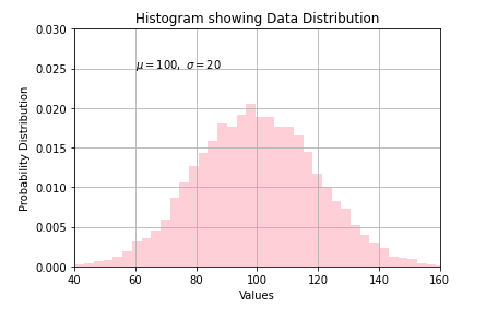
Example 1: Simple Matplotlib Histogram
This is the first example of matplotlib histogram in which we generate random data by using numpy random function.
To depict the data distribution, we have passed mean and standard deviation values to variables for plotting them.
The histogram function is provided the count of total values, number of bins, and patches to be created. Other parameters like density, facecolor, and alpha help in changing the appearance of the histogram.
The hist() function uses the default value for histtype parameter in this case.
With the help of xlim and ylim functions, we are able to set the minimum and maximum values for both x-axis and y-axis.
# Fixing random state for reproducibility
np.random.seed(19680801)

mu, sigma = 100, 20
x = mu + sigma * np.random.randn(10000)

# the histogram of the data
n, bins, patches = plt.hist(x, 50, density=True, facecolor='pink', alpha=0.75)


plt.xlabel('Values')
plt.ylabel('Probability Distribution')
plt.title('Histogram showing Data Distribution')
plt.text(60, .025, r'$\mu=100,\ \sigma=20$')
plt.xlim(40, 160)
plt.ylim(0, 0.03)
plt.grid(True)
plt.show()
Important Note
For large numbers of bins (>1000), ‘step’ and ‘stepfilled’ can be significantly faster than ‘bar’ and ‘barstacked’.
[adrotate banner=”3″]
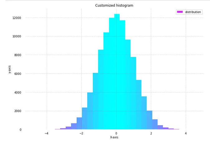
In this example of the matplotlib histogram, we will be customizing the color of the histogram for showing the data distribution. This will help in visualizing the different values across the range of data.
Once the dataset and distribution is created, we create the histogram. For this plot, the subplots function will be used. To make this plot more appealing, axes spines and x,y ticks are removed. After this padding and gridlines are added.
Lastly, the hist() function is called for plotting the histogram. The color is set over the histogram by dividing it in fractions. Through this method, different sections of the histogram are colored different colors.
With the help of the “for” loop, we can easily visualize the histogram with a range of colors over a range of data. As you can see the color darkens at the extreme ends and in the middle there is a lighter shade of color.
In the case of a histogram, the facecolor keyword helps in setting the color of the histogram.
from matplotlib import colors
from matplotlib.ticker import PercentFormatter


# Creating dataset
np.random.seed(23685752)
N_points = 100000
n_bins = 30

# Creating distribution
x = np.random.randn(N_points)
y = .8 ** x + np.random.randn(100000) + 35
legend = ['distribution']

# Creating histogram
fig, axs = plt.subplots(1, 1, figsize =(10, 7),  tight_layout = True)


# Remove axes spines
for s in ['top', 'bottom', 'left', 'right']:
    axs.spines[s].set_visible(False)

# Remove x, y ticks
axs.xaxis.set_ticks_position('none')
axs.yaxis.set_ticks_position('none')

# Add padding between axes and labels
axs.xaxis.set_tick_params(pad = 5)
axs.yaxis.set_tick_params(pad = 10)

# Add x, y gridlines
axs.grid(b = True, color ='grey',  linestyle ='-.', linewidth = 0.5,  alpha = 0.6)

# Creating histogram
N, bins, patches = axs.hist(x, bins = n_bins)

# Setting color
fracs = ((N**(1 / 5)) / N.max())
norm = colors.Normalize(fracs.min(), fracs.max())

for thisfrac, thispatch in zip(fracs, patches):
    color = plt.cm.cool_r(norm(thisfrac))
    thispatch.set_facecolor(color)

# Adding extra features
plt.xlabel("X-axis")
plt.ylabel("y-axis")
plt.legend(legend)
plt.title('Customized histogram')

# Show plot
plt.show()
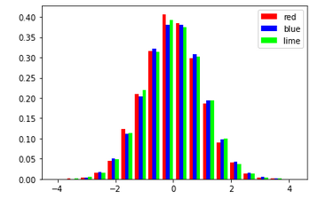
Example 3: Matplotlib Histogram with Bars
In the 3rd example of this matplotlib histogram tutorial, we’ll now see how to incorporate bars into a histogram. For this, we simply have to generate random data by using numpy’s random() function. Then, when we call the hist() function of the matplotlib library, we can pass the value bar in the histtype parameter. We also have the option of creating a stacked bar chart in the histogram by passing barstacked value in above mentioned parameter.
The size of the legend can also be increased or decreased by using the legend function.
np.random.seed(10**9)
n_bins = 18
x = np.random.randn(10000, 3)

colors = ['red', 'blue', 'lime']

plt.hist(x, n_bins, density = True,  histtype ='bar', color = colors, label = colors)

plt.legend(prop ={'size': 10})

plt.show()
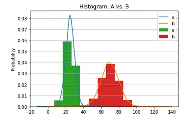
Example 4: Matplotlib Histogram with KDE Plot
This histogram example will showcase how one can combine histogram and kernel density estimation or KDE plot in a single visualization. For this example, we will assign random values to means and standard deviations. Then a dataframe is created with means passed to ‘loc’ parameter and standard deviations passed to ‘scale’ parameter.
This helps in generating random data. We also have a look at the aggregate values i.e. minimum, maximum, mean, and standard deviation of the two columns of values in this random data.
means = 25, 70
stdevs = 5, 10
dist = pd.DataFrame(np.random.normal(loc=means, scale=stdevs, size=(10000, 2)),columns=['a', 'b'])
dist.agg(['min', 'max', 'mean', 'std']).round(decimals=2)
Out[5]:
| a | b | |
|---|---|---|
| min | 6.78 | 36.60 |
| max | 43.41 | 103.69 |
| mean | 24.96 | 69.94 |
| std | 5.05 | 9.85 |
With the help of subplots function, we can plot the KDE and histogram together. The output shown below depicts the probability distribution of data where the kernel density estimation plot also helps in knowing the probability of data in a given space.
fig, ax = plt.subplots()
dist.plot.kde(ax=ax, legend=True, title='Histogram: A vs. B')
dist.plot.hist(density=True, ax=ax)
ax.set_ylabel('Probability')
ax.grid(axis='y')
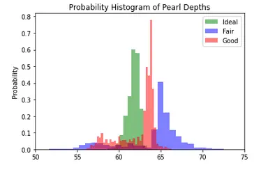
Example 5: Probability Histogram with multiple values
For the next two examples, we will be using a dataset in which different pearls are rated on different attributes. So with the help of pandas, we first load the csv file into a dataframe. The next step is to assign data into different variables for creating three different groups on the basis of pearl ratings. To obtain apt visualization we have to normalize the data.
At last, we call the hist() function thrice to render the histograms for the three quality ratings of pearl. The gca() function or get the current axis function helps in the creation of appropriate axes if there is no axis for a particular figure.
import pandas as pd

df = pd.read_csv("pearls.csv")
df.head()
x1 = df.loc[df.Rating=='Ideal', 'Depth']
x2 = df.loc[df.Rating=='Fair', 'Depth']
x3 = df.loc[df.Rating=='Good', 'Depth']

# Normalize
kwargs = dict(alpha=0.5, bins=50, density=True, stacked=True)

# Plot
plt.hist(x1, **kwargs, color='g', label='Ideal')
plt.hist(x2, **kwargs, color='b', label='Fair')
plt.hist(x3, **kwargs, color='r', label='Good')
plt.gca().set(title='Probability Histogram of Pearl Depths', ylabel='Probability')
plt.xlim(50,75)
plt.legend();
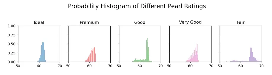
Example 6: Histogram for visualizing categories
In this last example of our matplotlib tutorial on histogram, we are plotting histogram for different categories of a given dataset. This kind of histogram is useful in comparison studies. Here in this case, 5 different histograms are created for 5 different quality ratings of the pearls.
Again to visualize multiple plots, we use subplots() function. After specifying the color for the 5 different plots, we will be using for loop along with enumerate function to plot the 5 different histograms on the basis of different Ratings of pearls.
We use suptitle function to give the plot a title and we also use set_xlim function for providing the minimum and maximum limits for x-axis.
The reason behind using tight_layout function is that it helps in displaying the subplots in the figure cleanly by managing the parameters on its own.
# Plot
fig, axes = plt.subplots(1, 5, figsize=(10,2.5), dpi=100, sharex=True, sharey=True)
colors = ['tab:blue', 'tab:red', 'tab:green', 'tab:pink', 'tab:purple']

for i, (ax, Rating) in enumerate(zip(axes.flatten(), df.Rating.unique())):
    x = df.loc[df.Rating==Rating, 'Depth']
    ax.hist(x, alpha=0.5, bins=55, density=True, stacked=True, label=str(Rating), color=colors[i])
    ax.set_title(Rating)

plt.suptitle('Probability Histogram of Different Pearl Ratings', y=1.05, size=16)
ax.set_xlim(50, 70); ax.set_ylim(0, 1);
plt.tight_layout();
Conclusion
It’s time to end this matplotlib histogram tutorial in which we built various kinds of interesting histograms. We looked at how colors can be customized for histograms, how we can visualize different histograms for multiple categories in a dataset. And we also talked about the minute details that are involved in building a complete histogram with all the necessary information.
Reference – Matplotlib Documentation