Introduction
Boxplots are a useful visualization technique to understand the distribution and outliers in a dataset. In this article, we will go through the tutorial for box plot in ggplot2 function of R which is a popular visualization package. We will first understand the syntax of ggplot2 function geom_boxplot() for boxplot and then see various examples for easy understanding of beginners.
Syntax of Box Plot in ggplot2
The minimum syntax for creating the box plot in ggplot2 is
ggplot(<data>, mapping = aes()) + geom_boxplot()
You can easily customize the box plot in ggplot2 by adding more layers of theme, labs, etc. to create complex boxplots.
Examples of Box Plot in ggplot2
Load the Dataset
For all the examples of ggplot2 boxplot, we are going to use the Tips dataset that gives information on the tips paid by customers in restaurants.
Let us first load this dataset in a data frame df and see some of its records.
library(ggplot2)

df <- read.table("tips.csv",header=TRUE,sep=',')
options( warn = -1 )
head(df)
| total_bill | tip | sex | smoker | day | time | size |
|---|---|---|---|---|---|---|
| 16.99 | 1.01 | Female | No | Sun | Dinner | 2 |
| 10.34 | 1.66 | Male | No | Sun | Dinner | 3 |
| 21.01 | 3.50 | Male | No | Sun | Dinner | 3 |
| 23.68 | 3.31 | Male | No | Sun | Dinner | 2 |
| 24.59 | 3.61 | Female | No | Sun | Dinner | 4 |
| 25.29 | 4.71 | Male | No | Sun | Dinner | 4 |
Example 1: Basic Box Plot in ggplot2
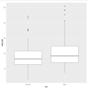
First, we will pass our dataset ‘df’ to ggplot() along with ‘sex’ and ‘total_bill’ as our x and y attributes.
We then add the second layer of geom_boxplot() to create the boxplot which is quite basic and minimalistic.
# Basic box plot
ggplot(df, aes(x=sex, y=total_bill)) +
  geom_boxplot()
Example 2: Horizontal Box Plot in ggplot2
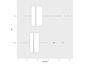
To create a horizontal box plot in ggplot2 coord_flip() function is used to rotate our box plot by 90 degrees as shown below.
ggplot(df, aes(x=sex, y=total_bill)) +
  geom_boxplot() + coord_flip()
Example 3: Notched Box Plot
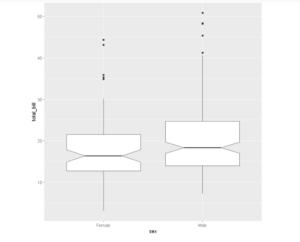
In a notched boxplot, there is a notch around the median that displays the confidence interval around the median.
The confidence interval is a range of values around the particular that is supposed to contain, with a certain probability (e.g.95%), the true value of that statistic (the population value).
To create a box plot with a notch just pass the parameter notch=True to geom_boxplot() function.
ggplot(df, aes(x=sex, y=total_bill)) +
  geom_boxplot(notch=TRUE)
Example 4: Changing the shape of outliers
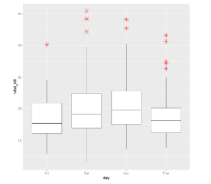
You can change the color, shape, and size of the outliers by using the various properties of outliers inside geom_boxplot() as shown in the below example.
ggplot(df, aes(x=day, y=total_bill)) +
  geom_boxplot(outlier.colour="red", outlier.shape=8,
                outlier.size=4)
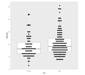
Example 5: Box plot with a Dot plot
We can add Dots (or points) to the box plot using the functions geom_dotplot() or geom_jitter()
ggplot(df, aes(x=sex, y=total_bill)) +
  geom_boxplot()+ geom_dotplot(binaxis='y', stackdir='center', dotsize=0.5)
`stat_bindot()` using `bins = 30`. Pick better value with `binwidth`.
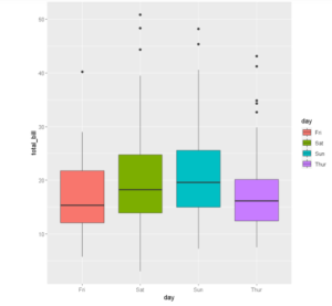
Example 6: Applying colors to Box Plot based on groups
To add some aesthetics, we can change the color of our boxplots according to the groups they represent. Here we are segregating boxplots based on the day of the week. We use the fill command to do this.
ggplot(df, aes(x=day, y=total_bill, fill=day)) +
  geom_boxplot()
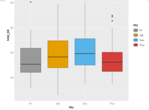
Example 7: Applying Custom Colors to Boxplot with scale_fill_manual()
For applying custom colors to boxplot manually, scale_fill_manual can be used to define the color palette as shown below.
# Use custom color palettes
ggplot(df, aes(x=day, y=total_bill, fill=day)) +
  geom_boxplot()+scale_fill_manual(values=c("#999999", "#E69F00", "#56B4E9",'#D43F3A'))
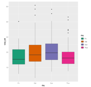
Example 8: Applying Custom Colors to Boxplot with scale_fill_brewer()
The ggplot2 boxplot can also be covered with scale_fill_brewer() by passing the brewer color palettes. In the below example, the Dark2 color palette is used.
ggplot(df, aes(x=day, y=total_bill, fill=day)) +
  geom_boxplot()+scale_fill_brewer(palette="Dark2")
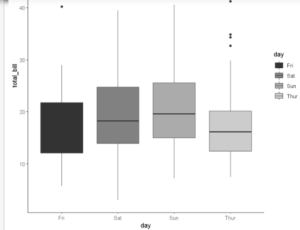
Example 9: Applying Grayscale to Box Plot with scale_fill_grey()
To create a box plot with grayscale scale_fill_grey() can be used as shown below.
ggplot(df, aes(x=day, y=total_bill, fill=day)) +
  geom_boxplot() + scale_fill_grey() + theme_classic()
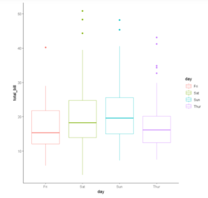
Example 10: Applying Outline Colors to Box Plot
To give color to the outline of the boxplot the color parameter can be used as shown below.
ggplot(df, aes(x=day, y=total_bill, color=day)) +
    geom_boxplot() +
    theme_classic()
Example 11: Change the legend position to Top
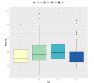
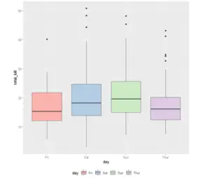
We can change the positions of the legend and place it conveniently, either on top, bottom, we can even remove it altogether using the legend.position option.
In the below example the legend has been placed on top.
ggplot(df, aes(x=day, y=total_bill, fill=day)) +
  geom_boxplot() + theme(legend.position="top")+ scale_fill_brewer(palette="YlGnBu")
ggplot(df, aes(x=day, y=total_bill, fill=day)) +
  geom_boxplot()+ theme(legend.position="bottom")+scale_fill_brewer(palette="Pastel1")
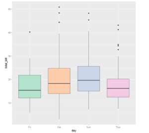
ggplot(df, aes(x=day, y=total_bill, fill=day)) +
  geom_boxplot() + theme(legend.position="none")+scale_fill_brewer(palette="Pastel2")
Example 12: Box plot with multiple groups
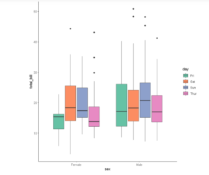
It is also possible to add multiple groups to the box plot by using the fill option of aes inside geom_boxplot() as shown below.
ggplot(df, aes(x=sex, y=total_bill)) +
    geom_boxplot(aes(fill =day)) +
    theme_classic()+scale_fill_brewer(palette="Set2")
- Also Read – Tutorial for Heatmap in ggplot2 with Examples
-
I am passionate about Analytics and I am looking for opportunities to hone my current skills to gain prominence in the field of Data Science.
View all posts


