Introduction
In this article, we will go through the tutorial for drawing Line Plot in R with ggplot2 package. ggplot2 is a commonly used open-sourced R package for creating beautiful visualizations. We will first explain the syntax for geom_line() geometric object that is used for generating line plots in ggplot2. And then we will present different kinds of examples for creating the line plots with this library.
Syntax of Line Plot in ggplot2
The minimal syntax for generating a line plot in ggplot2 is
ggplot(<data>, mapping = aes(<mapping>) + geom_line()
However, for better visualization and aesthetic looks, the more common practice is to add scatter plot points with the line plot as below –
ggplot(<data>, mapping = aes(<mapping>) + geom_line() + geom_point()
ggplot2 lets you add more layers to the plot such as theme, labs, etc. to create more advanced scatter plots.
Examples of Line Plot in R using ggplot2
Loading ggplot2 Library
We start by loading the ggplot2 library as shown below.
In[0]:
library(ggplot2)
Loading Dataset
We are going to use the cars dataset for all examples of line plot. The dataset is loaded into the data frame and its sample rows are shown.
df <- read.table("Cars.csv",header=TRUE,sep=',')
options( warn = -1 )
head(df)
| name | year | selling_price | km_driven | fuel | seller_type | transmission | owner |
|---|---|---|---|---|---|---|---|
| Maruti 800 AC | 2007 | 60000 | 70000 | Petrol | Individual | Manual | First Owner |
| Maruti Wagon R LXI Minor | 2007 | 135000 | 50000 | Petrol | Individual | Manual | First Owner |
| Hyundai Verna 1.6 SX | 2012 | 600000 | 100000 | Diesel | Individual | Manual | First Owner |
| Datsun RediGO T Option | 2017 | 250000 | 46000 | Petrol | Individual | Manual | First Owner |
| Honda Amaze VX i-DTEC | 2014 | 450000 | 141000 | Diesel | Individual | Manual | Second Owner |
| Maruti Alto LX BSIII | 2007 | 140000 | 125000 | Petrol | Individual | Manual | First Owner |
Example 1: Basic Line plot in ggplot2
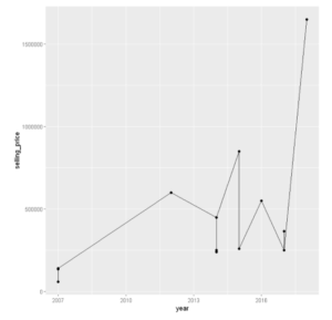
Let us plot the basic ggplot2 line plot using the geom_line() for the first 10 records of the dataset for ‘year’ vs ‘selling_price’
# Basic line plot with points

ggplot(data=head(df, n=20), aes(x=year, y=selling_price)) +
  geom_line()+
  geom_point()
Example 2: Change Line type
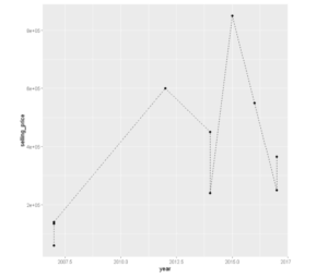
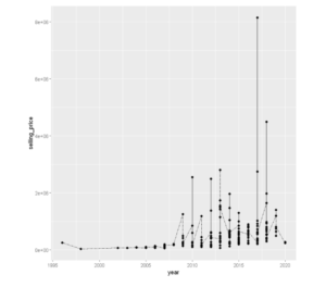
The type of the line plot can be changed by passing the linetype parameter that has several options like dotted, two dashes, dashed, etc.
In the following two examples, we have used ‘dashes’ and ‘twodashes’ in the linetype parameter.
# Change the line type
ggplot(data=head(df, n=10), aes(x=year, y=selling_price)) +
  geom_line(linetype = "dashed")+
  geom_point()
ggplot(data=head(df, n=200), aes(x=year, y=selling_price)) +
  geom_line(linetype = "twodash")+
  geom_point()
Example 3: Change line color
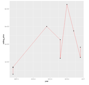
Let’s change the line color using the color parameter of geom_line( ). In the below example, we have used red color.
# Change the color
ggplot(data=head(df, n=10), aes(x=year, y=selling_price, group=1)) +
  geom_line(color="red")+
  geom_point()
Example 4: Change the size of the Line Plot in ggplot2
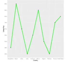
The line size can be customized using the command size and passing the value of the size inside geom_line( ).
# Format the line size
ggplot(data=head(df, n=10), aes(x=Country, y=Urban.Pop, group=1)) +
  geom_line(color="green",size=1.5)+
  geom_point()
Example 5: Add Titles to Line plot
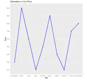
ggtitle() can be used to add plot title and labs() can be used to add axes title.
line<-ggplot(data=head(df, n=10), aes(x=Country, y=Urban.Pop, group=1)) +
  geom_line(color="blue",size=1.1)+
  geom_point() +
  ggtitle("Kilometres vs Car Price")+
  labs(x="KM",y="Price")
Example 6: Add Arrows to the Line Plot
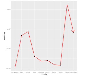
To add an arrow to our line we use the arrow parameter and pass it an arrow( ).
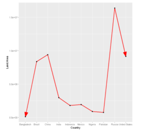
We can also change the parameters in an arrow-like angle, type ends in the arrow object as shown in the second example below.
# Adding an arrow
ggplot(data=head(df, n=10), aes(x=Country, y=Land.Area, group=1)) +
  geom_line(arrow=arrow(),size=1.1,color='red')+
  geom_point()
# Adding  closed arrow on both ends of the line
arr=arrow(angle = 20, ends = "both", type = "closed")
ggplot(data=head(df, n=10), aes(x=Country, y=Land.Area, group=1)) +
  geom_line(arrow=arr,size=1.1,color='red')+
  geom_point()
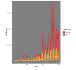
Example 7: Multiple Line Plots
To plot multiple line plots in one graph, we don’t have to change much except the group attribute has to be set to the name of the column based on which different lines will be plotted
# Color selection
cols <- c("#D43F3A", "#EEA236")

ggplot(df, aes(x =year, y =selling_price , color =transmission)) +
  geom_line(size=3) +
  scale_color_manual(values = cols) + theme_dark()
Example 8: Legend Customization
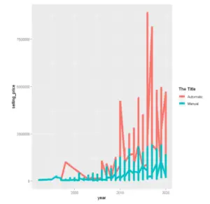
We can change the title of our legend of the line plot using the guide_legend() function as shown below.
ggplot(df, aes(x =year,y=selling_price , color =transmission)) +
  geom_line(size=2.5) +
  guides(color = guide_legend(title = "The Title"))
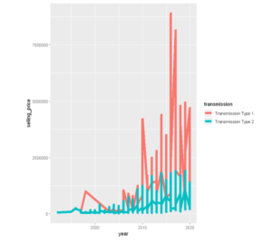
Here we change the Legend Labels:
ggplot(df, aes(x =year,y=selling_price , color =transmission)) +
  geom_line(size=2.5) +
  scale_color_discrete(labels = paste("Transmission Type", 1:2))
Example 9: Creating Line Plot based on Conditions
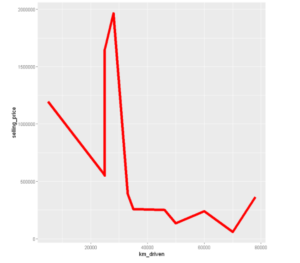
We can create the line plot for the dataset based on the condition that the selling_price for cars that have driven less than 100 thousand kilometers.
ss <- subset(head(df,n=30), km_driven<100000)
ggplot(data = ss, aes(x=km_driven, y=selling_price)) + geom_line(size=2.5, color='red')
Example 10: Adding Data Labels in Line Plot
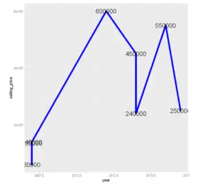
Now let us add some data labels, here we use labels to get the values in the y-axis and nudge_y to place the data label.
ggplot(data=head(df,n=8), aes(x=year, y=selling_price, group=1,label=selling_price)) +
  geom_line(color='blue',size=2.5)+
  geom_point()+
  geom_text(nudge_y = 3, size=6)
-
I am passionate about Analytics and I am looking for opportunities to hone my current skills to gain prominence in the field of Data Science.
View all posts


