Introduction
In this tutorial, we will show you how to create scatter plot in R with ggplot2 package. ggplot2 is a very popular open-source package in R that can be used to create simple and complex visualization. Here, we will first cover the syntax of geom_point() geometric object for creating scatter plot in ggplot2. Then we will cover various examples of simple and advanced scatter plots using this library.
Syntax of Scatter Plot in ggplot2
The minimal syntax for creating the scatter plot in ggplot2 is
ggplot(<data>, mapping = aes(<mapping>) + geom_point()
ggplot2 lets you add more layers to the plot such as theme, labs, etc. to create more advanced scatter plots.
Examples of Scatter Plot in R using ggplot2
Loading Library
Let us start by loading the ggplot2 library.
We are going to use the inbuilt CO2 dataset of R for all our examples of scatter plots with ggplot2. CO2 dataset shows the tolerance of various specimen of grasses against cold.
We can see a glimpse of the first few rows of the CO2 dataset below.
library(ggplot2)

head(CO2)
| Plant | Type | Treatment | conc | uptake |
|---|---|---|---|---|
| Qn1 | Quebec | nonchilled | 95 | 16.0 |
| Qn1 | Quebec | nonchilled | 175 | 30.4 |
| Qn1 | Quebec | nonchilled | 250 | 34.8 |
| Qn1 | Quebec | nonchilled | 350 | 37.2 |
| Qn1 | Quebec | nonchilled | 500 | 35.3 |
| Qn1 | Quebec | nonchilled | 675 | 39.2 |
Example 1: Basic Scatter Plot with ggplot2
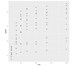
Here, we first pass the dataset CO2 to ggplot along with aesthetic mapping of x and y coordinates with the dataset attributes. We then add the second layer of geom_point() to it that finally produces the scatter plot which is quite basic and minimalistic.
ggplot(CO2, mapping = aes(x = conc, y =uptake)) + geom_point()
Example 2: Scatter Plot with custom Colors in ggplot2
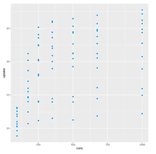
This is the extension of the previous example of a basic scatter plot. Here we pass the hex value of the required color as a parameter to the geom_point() and the same color is rendered in the scatter plot.
ggplot(CO2, mapping = aes(x = conc, y =uptake)) +
geom_point(color = "#0099f9")
Out[2]:
Example 3: Scatter Plot Size in ggplot2
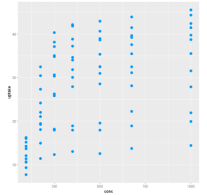
The size of the scatter plot markers can be increased by passing the size argument in geom_point(). In this example, we have passed size = 3.
ggplot(CO2, mapping = aes(x = conc, y =uptake)) +
geom_point(size =3, color = "#0099f9")
Example 4: Adding Transparency in Scatter Plot
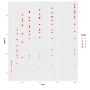
The transparency of the points can also be customized with the alpha argument in aes() i.e. the aesthetic part. You can pass a value for consistent transparency or you can pass a variable, so the transparency will vary on the value of the variable. We have used the “uptake” variable of the dataset as the alpha value.
ggplot(CO2, aes(x = conc, y =uptake, alpha =uptake)) +
  geom_point(size=3,colour = 2)
Example 5: Customize Scatter Plot Color based on Values
The geom_point function allows coloring the points based on some conditions. In the below examples the color of the points are set based on the range uptake variable of the CO2 dataset.
In [5]:
ggplot(CO2, mapping = aes(x = conc, y =uptake)) +
geom_point(size=3, aes(colour = uptake > 25 & uptake < 40), show.legend = FALSE)
Out[5]:
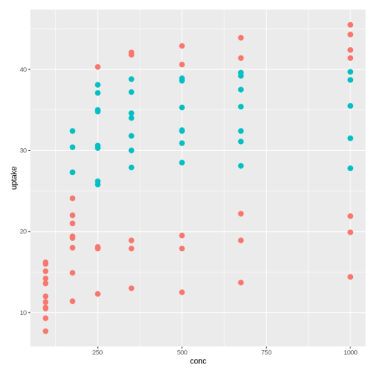
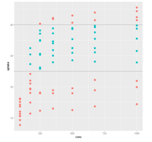
To give a better visualization of how the color of scatter plots are divided we have added two horizontal lines in the above code.
ggplot(CO2, mapping = aes(x = conc, y =uptake)) +
geom_point(size=3, aes(colour = uptake > 25 & uptake < 40), show.legend = FALSE) +
geom_hline(yintercept = 25, linetype = "dashed") +
geom_hline(yintercept = 40, linetype = "dashed")
Example 6: Scatter plot with different shapes in R ggplot2
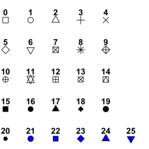
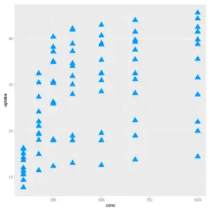
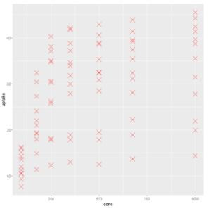
The shapes of the scatter plot in ggplot2 can be changed quite easily with the shape argument in geom_point(). The various shapes have got a specific number that you need to pass to geom_point() for your needs. The various shapes and their corresponding number are shown below –
ggplot(CO2, mapping = aes(x = conc, y =uptake))
+ geom_point(size = 5, color = "#0099f9", shape = 17)
ggplot(CO2, mapping = aes(x = conc, y =uptake))
 + geom_point(size = 5, color = "red", shape = 4)
Example 7: Scatter Plot with Groups
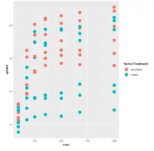
In the following example, we have grouped the scatter plot points based on the value of the Treatment variable of the dataset by passing it as a factor to the color parameter.
ggplot(CO2, mapping = aes(x = conc, y =uptake))
+ geom_point(size = 5,aes(color = factor(Treatment)))
Example 8: Creating scatter plot with fitted values
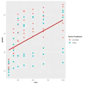
We can draw a line to fit the scatter plot data using stat_smooth
ggplot(CO2, mapping = aes(x = conc, y =uptake)) +
geom_point(size=3,aes(color = factor(Treatment))) +
stat_smooth(method = "lm", col = "#C42126", se = FALSE, size = 2)
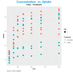
Example 9: Adding Title, Subtitle, and Caption in Scatter Plot
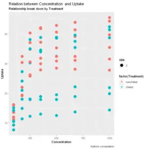
Adding title, subtitle, and captions give a better interpretation of the scatter plot graph otherwise it uses the default values derived from the dataset that may not be self-explanatory always.
In the ggplot2 scatter plot you can add them by labs() layer where we can pass the name of the axis, title, subtitle, and caption.
In [10]:
ggplot(CO2, aes(x = conc, y = uptake)) +

geom_point(aes(size=3,color = factor(Treatment))) +

labs( x = "Concentration",
y = "Uptake" ,
title = "Relation between Concentration and Uptake",
subtitle = "Relationship break down by Treatment",
caption = "Authors computation" )
ggplot(CO2, mapping = aes(x = conc, y =uptake))  +
  geom_point(color = "#0099f9", size = 3) +
  geom_point(aes(size =3, color =Treatment)) +
  labs(
    title = "Concentration  vs. Uptake",
    subtitle = "Color - Treatment",
    caption = "Source: R built in dataset"
  ) +
  theme(
    plot.title = element_text(color = "#0099f9", size = 20, face = "bold", hjust = 0.5),
    plot.subtitle = element_text(size = 13, face = "bold", hjust = 0.5),
    plot.caption = element_text(face = "italic", hjust = 0)
  )
Example 10: Adding Themes to Scatter Plot
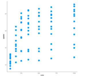
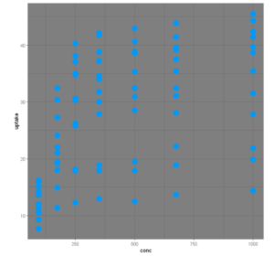
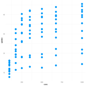
R allows us to customize out plot with different themes. The library ggplot2 includes eights themes:
- theme_bw()
- theme_light()
- theme_classis()
- theme_linedraw()
- theme_dark()
- theme_minimal()
- theme_gray()
- theme_void()
Let us explore a few of themes in the examples below:
ggplot(CO2, mapping = aes(x = conc, y =uptake))  +
  geom_point(size = 5, color = "#0099f9") +
  theme_classic()
ggplot(CO2, mapping = aes(x = conc, y =uptake)) +
  geom_point(size = 5, color = "#0099f9") +
  theme_dark()
ggplot(CO2, mapping = aes(x = conc, y =uptake))  +
  geom_point(size = 5, color = "#0099f9") +
theme_minimal()
Example 11: Save Scatter Plot in ggplot2
After all these steps, it is time to save and share your graph. You add ggsave(‘filename’) right after you plot the graph and it will be stored on the hard drive.
The graph is saved in the working directory. To check the working directory, you can run this code:
ggsave("Scatterplot.png")
-
I am passionate about Analytics and I am looking for opportunities to hone my current skills to gain prominence in the field of Data Science.
View all posts


